

In the heart of every home lies the living room—a sanctuary for relaxation,a gathering place for friends adn family,and a canvas for personal expression. As the backdrop to countless memories and moments, the walls of this space hold the power to influence its atmosphere and mood profoundly. In an era where individuality and creativity are celebrated, embracing vibrant wall colors can breathe new life into your living room, transforming it from a mere space into a vibrant reflection of your personality. This article invites you to explore the world of bold hues and tones, guiding you through the psychology of color, trending palettes, and practical tips for creating stunning visual impact. Whether you’re yearning for a dramatic statement or a soothing retreat, the right wall color can set the stage for an unforgettable living experience. Join us on this colorful journey as we uncover the transformative potential of paint and discover how to turn your living room into a masterpiece of style and comfort.
Transforming Living Rooms Through Color Psychology And Its Impact On Mood
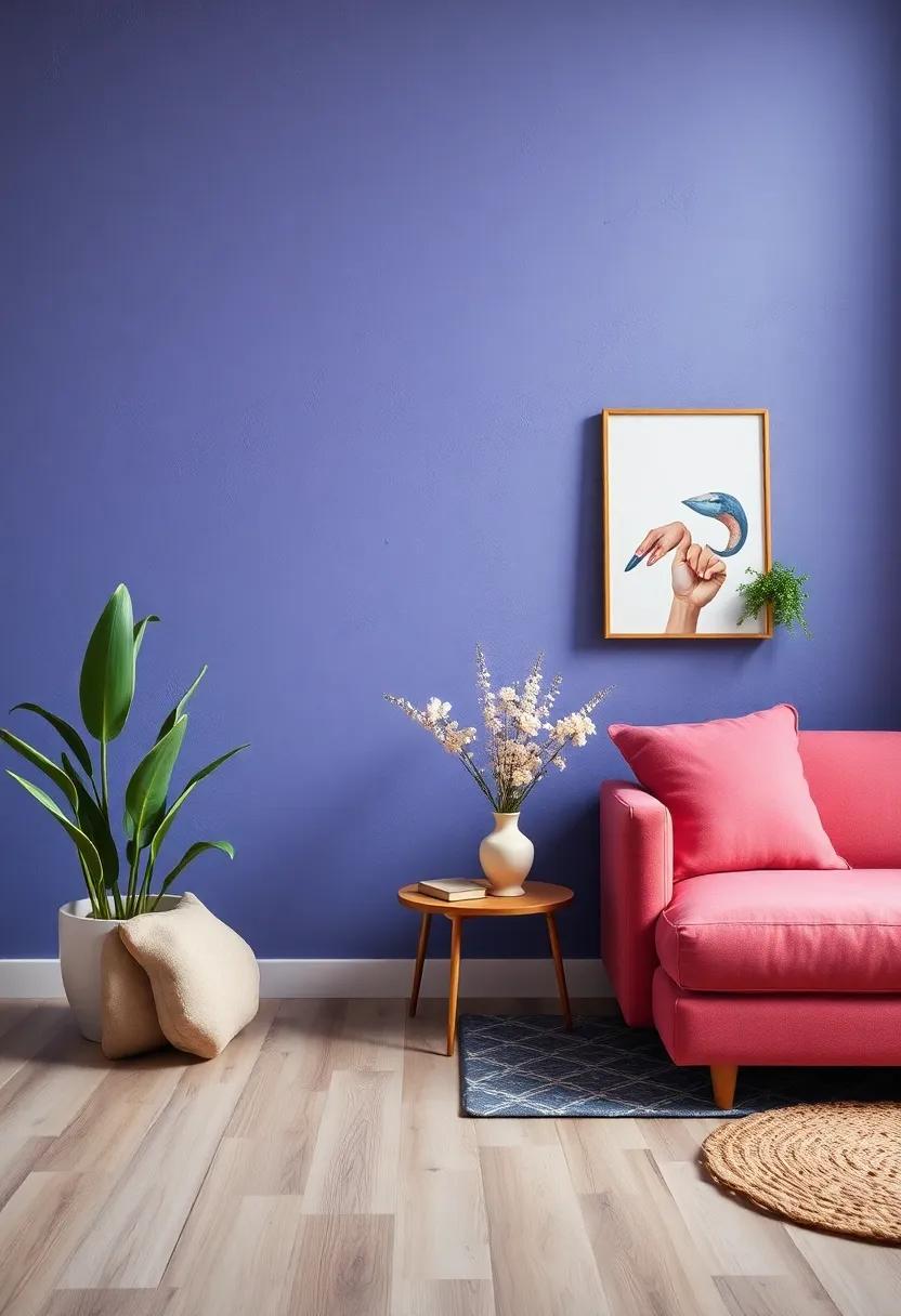
Color is a powerful tool in interior design, capable of eliciting various emotions and influencing our daily experiences in profound ways. When it comes to living rooms, the choice of wall colors can create an inviting atmosphere or a stark, unwelcoming space. For a cozy and nurturing surroundings, consider shades like warm greens or soft yellows, which can invoke a sense of peace and relaxation. In contrast, deeper blues and purples can provide a serene backdrop that encourages introspection and calm. By selecting colors aligned with your desired mood, you can transform your living room into a sanctuary that reflects your personality and enhances your overall well-being.
To better understand the psychological effects of different colors, consider the following list of hues and their mood-enhancing properties:
- Red: Energizing and stimulating, perfect for lively conversations.
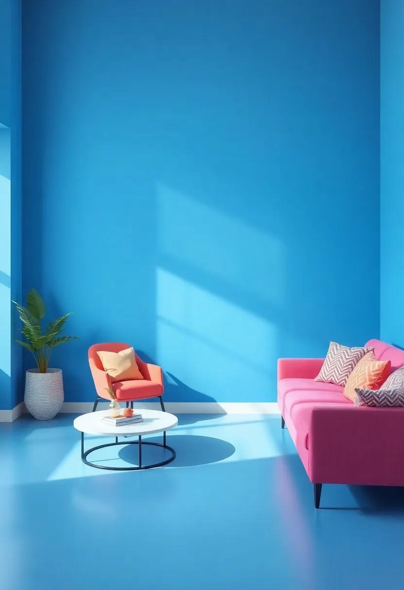
- Blue: Serene and calming, ideal for creating a tranquil setting.
- Yellow: Cheerful and uplifting, evoking happiness and warmth.
- Green: Refreshing and rejuvenating, associated with nature and balance.
- Purple: Creative and inspiring,adding a touch of luxury.
Understanding these associations can help you curate your living space to match your lifestyle and mood preferences. Below is a simple overview of the psychological impacts of various colors:
| Color | Mood Impact |
|---|---|
| Red | Excitement and Passion |
| Blue | Calm and Relaxation |
| Yellow | Happiness and Energy |
| Green | Harmony and Tranquility |
| Purple | Creativity and Luxury |
Unleashing Creativity By Combining Bold Wall Colors With Stylish Decor
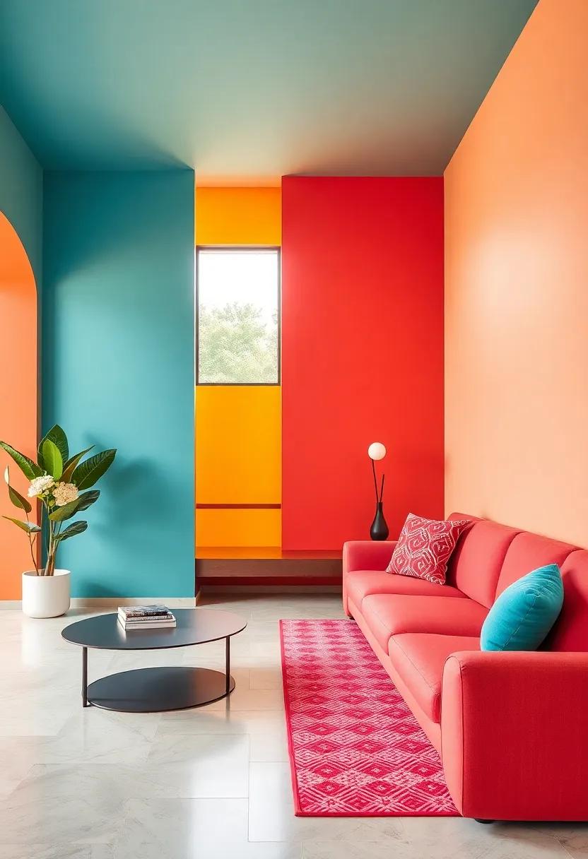
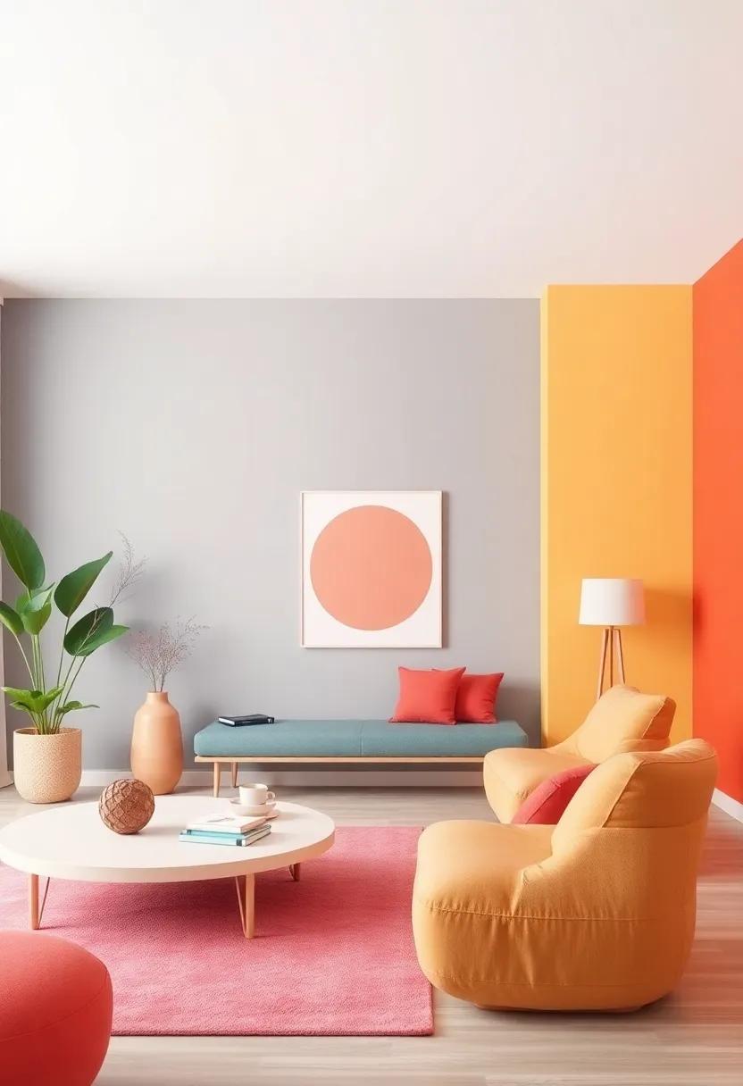
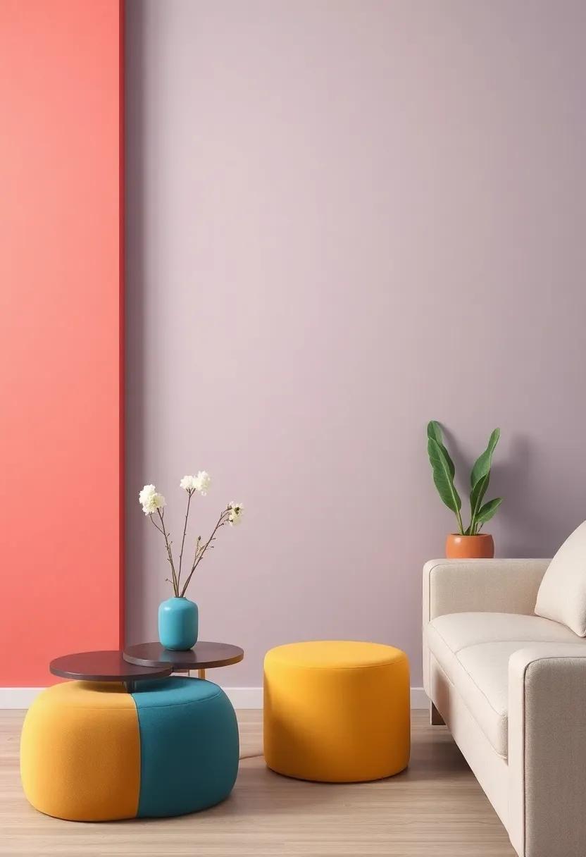
Transforming your living space frequently enough begins with the walls. By opting for bold colors like deep teal, vibrant coral, or striking mustard yellow, you can create a dynamic backdrop that sets the tone for the entire room. Pairing these audacious hues with carefully chosen decor elements can lead to a stunning visual impact. As a notable example,add neutral furniture to ground the palette,while incorporating contrasting accessories in similar bold shades to tie the room together. Consider using a mix of textures, such as a plush rug or decorative throw pillows with varying patterns, to enhance the depth and interest of your newly vibrant environment.
To further elevate the aesthetic appeal, consider introducing statement pieces that draw attention without overwhelming the design. A large piece of artwork or an eye-catching mirror can serve as a focal point, reflecting light and adding dimension. Combine this with accents like metallic lanterns or minimalist shelving to create a curated yet effortless vibe. With the right balance of color and decor, your living room can evolve into a welcoming oasis that inspires creativity and relaxation.
the Perfect Color Palette: Harmonizing Vibrant Hues For your Living Space
creating a captivating living space goes beyond merely selecting a wall color; it involves a thoughtful interplay of hues that breathe life and energy into your home. When combining vibrant colors, consider the emotional impact of each shade. For instance, pairing rich yellows with deep blues can evoke a summery warmth, while a blend of emerald greens and soft lavenders creates a serene, nature-inspired ambiance. Experiment with different combinations by testing swatches on your walls; the way light interacts with colors can change their appearance throughout the day, offering a dynamic aspect to your decor.Here are some vibrant pairings to ignite your creativity:
- Coral and Teal: A lively yet harmonious contrast.
- Mustard and Navy: Bold and sophisticated synergy.
- Berry and Mint: Playful yet refreshing aesthetics.
Once you’ve selected your palette, consider the role of accessories and furnishings in bolstering your color selections. Sofas, cushions, and artwork can either accentuate or temper bold wall colors, creating a balanced look. Incorporate textures and patterns to diversify the visual appeal: plush fabrics, sleek metallics, and natural woods can add depth. To keep your space from feeling chaotic, applying a color ratio can ensure everything feels cohesive. Below is a simple guide for maintaining harmony:
| color Role | Recommended Ratio |
|---|---|
| Dominant Color | 60% |
| Secondary Color | 30% |
| Accent Color | 10% |
Embracing Eclectic styles: Mixing Patterns And Colors For unique Walls
When it comes to creating a visually stunning and dynamic living room, the fusion of different patterns and colors can be a game-changer. Bold geometric prints paired with soft florals can create an intriguing balance that captivates the eye. Consider opting for mixed patterns on your walls through wall decals, stencils, or wallpaper. These can add depth and personality, transforming a mundane space into a work of art. When selecting a palette, think about how each hue will interact; colors from the same family can provide harmony while contrasting shades inject energy. Remember,the key is to create a cohesive look that reflects your personality and style.
To further enhance your unique walls, consider incorporating accessories and furniture that echo the eclectic theme. This can include:
- Textured textiles: Layer different fabric patterns through cushions, drapes, and throws.
- Artwork diversity: Hang a mix of framed prints,canvas art,and even tapestries to complement your walls.
- Decorative accents: Use vases,lamps,and books with varied patterns to tie together the color scheme.
A harmonious blend of colors can be better visualized through a simple color wheel, showcasing complementary and triadic options:
| Color Pairing | Use Case |
|---|---|
| Blue & Orange | Modern & Energetic vibe |
| Green & Purple | Eclectic & Artistic Look |
| Yellow & gray | Radiant & Balanced space |
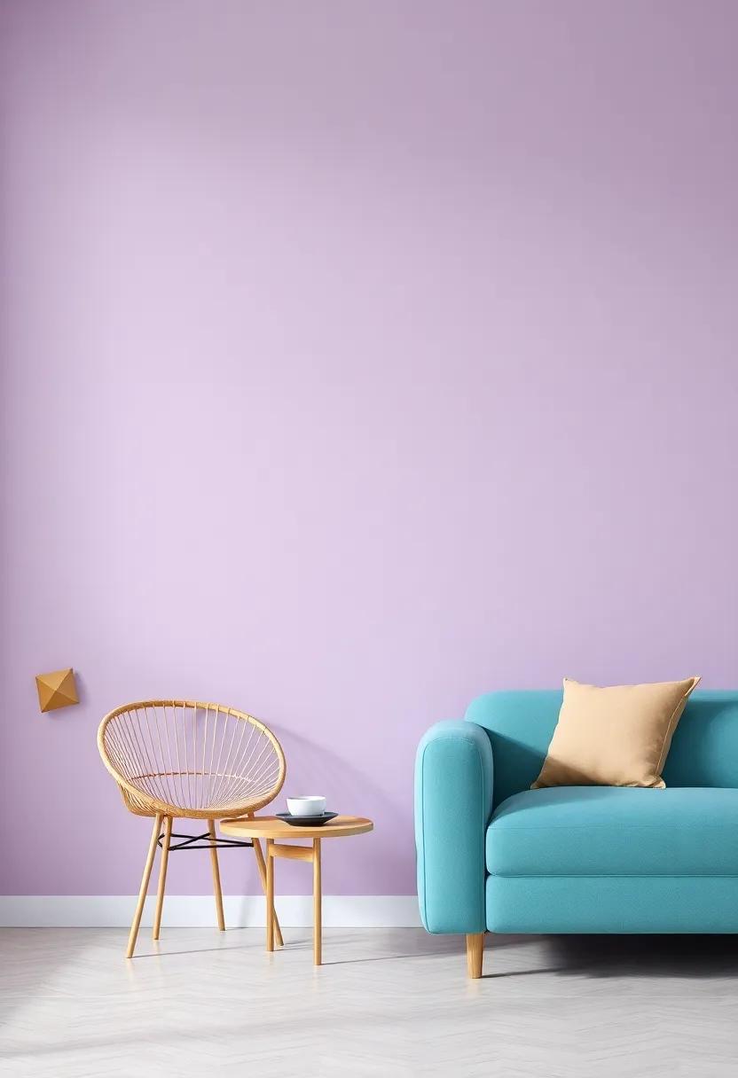
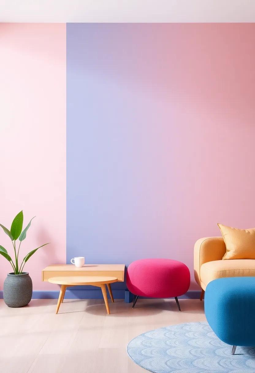
Exploring the Calmness Of Soft Pastels In Vibrant Living Room Designs
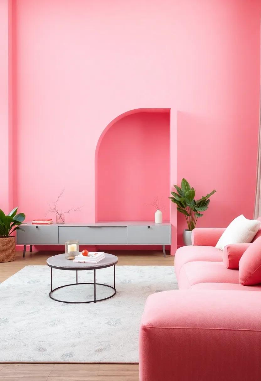
The serene allure of soft pastels creates a tranquil environment, making it a perfect choice for vibrant living room designs. Pastel shades, such as mint green, lavender, and blush pink, can harmoniously balance bolder colors, allowing them to shine without overwhelming the senses. These gentle hues act as a foundation to showcase statement pieces, like a striking piece of art or a quirky coffee table. Pairing soft pastels with natural textures—such as wicker furniture or wooden accents—amplifies the calming affect, inviting relaxation into your space.
To further enhance the ambiance, consider incorporating accessories that complement the pastel palette. Textiles like cushions, throws, and rugs in varying shades can add depth while maintaining serenity. here are some ideas for combining pastels effectively:
| Color combo | impact |
|---|---|
| Mint Green & Coral | Fresh and modern |
| Lavender & Soft Yellow | Cheerful and inviting |
| Blush Pink & Light Grey | Elegant and soft |
Mixing furniture styles and incorporating art pieces featuring pastel tones can definitely help deepen the visual narrative in your living room. Soft pastels can work together with vibrant wall colors, creating a versatile environment conducive to both relaxing evenings and lively gatherings. Whether you prefer minimalistic decor or vibrant eclectic styles, embracing these soothing tones in your design allows for a beautiful, balanced atmosphere.
Dramatic Dark Shades: How Deep Colors Can Add Sophistication To Spaces
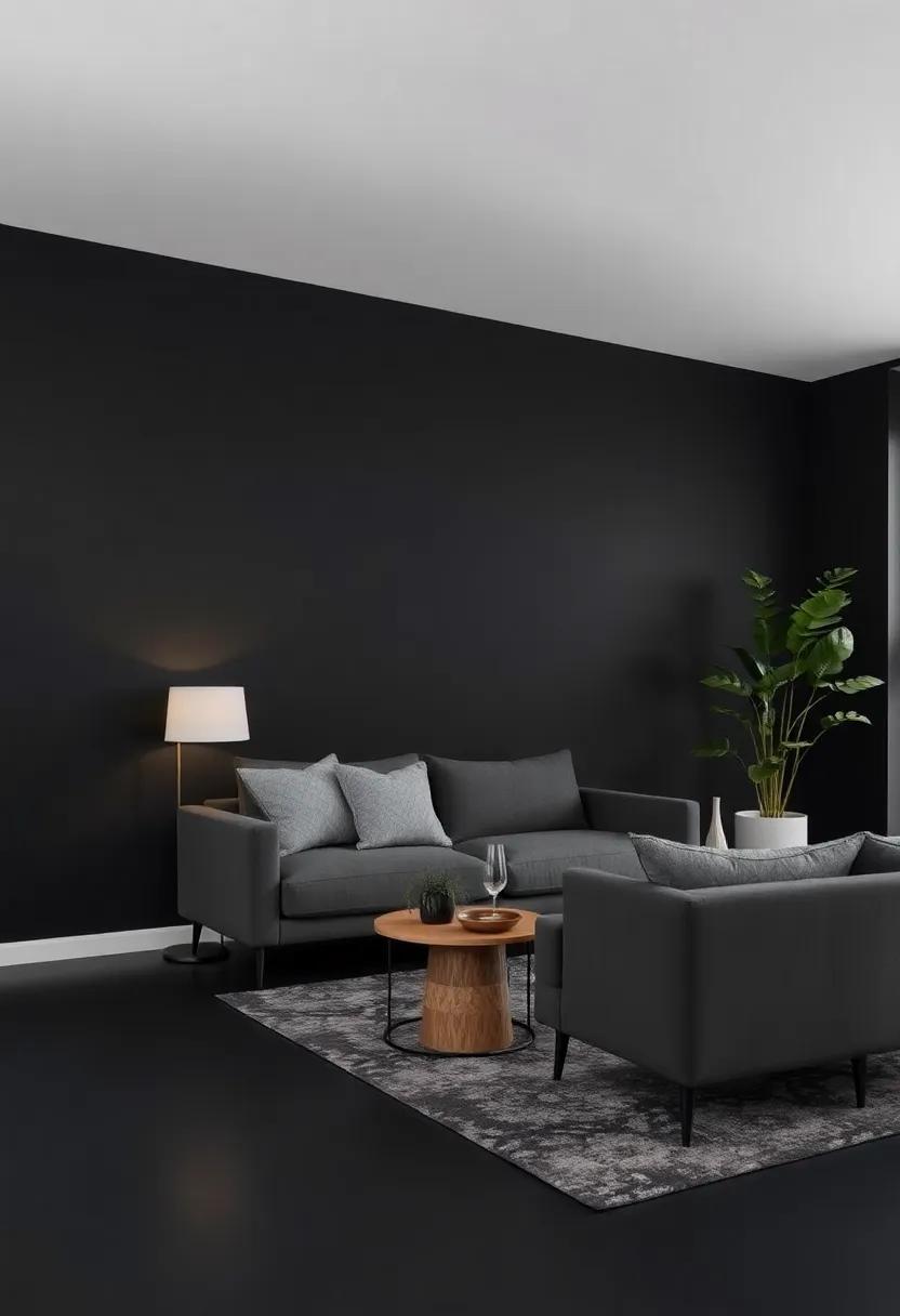
Dramatic dark shades can serve as the perfect backbone for a sophisticated living space, transforming a room from mundane to magnificent. These deep hues—think rich navy blues, intense forest greens, and charcoal grays—infuse an air of elegance and depth.When used strategically, they can highlight architectural features and create a cozy, enveloping atmosphere. Pairing these shades with lighter accents can create a stunning contrast, making the entire space feel more dynamic and layered.To enhance this effect, consider adding textures through fabrics in laces, velvets, or leathers to play off the surrounding walls.
Incorporating dark colors into your living room opens up a world of design possibilities. Here are a few ideas to inspire you:
- Accent Walls: A single, dark-painted wall can anchor the room while allowing lighter furniture and decor to pop.
- Artwork Display: Deep colors create a dramatic backdrop for artwork, drawing attention and enriching the viewer’s experience.
- Lighting Choice: Warm or soft lighting can soften the intensity of dark shades, creating an inviting environment.
- Contrasting Furniture: Light or natural wood furniture can stand out beautifully against a dark background, adding a modern touch.
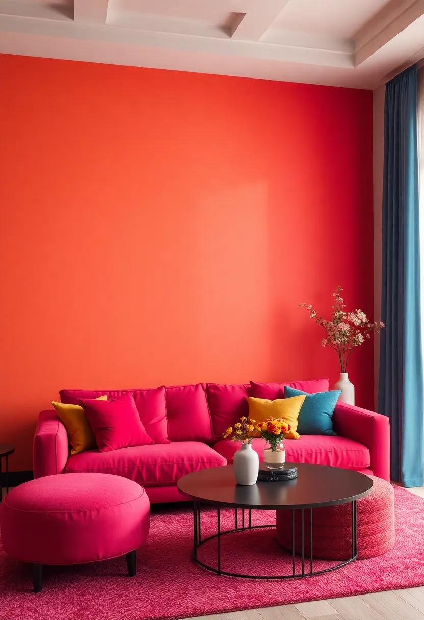
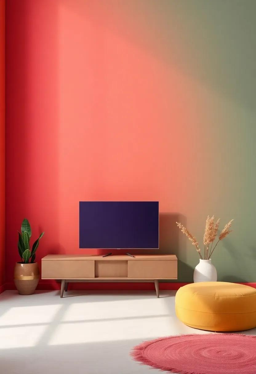
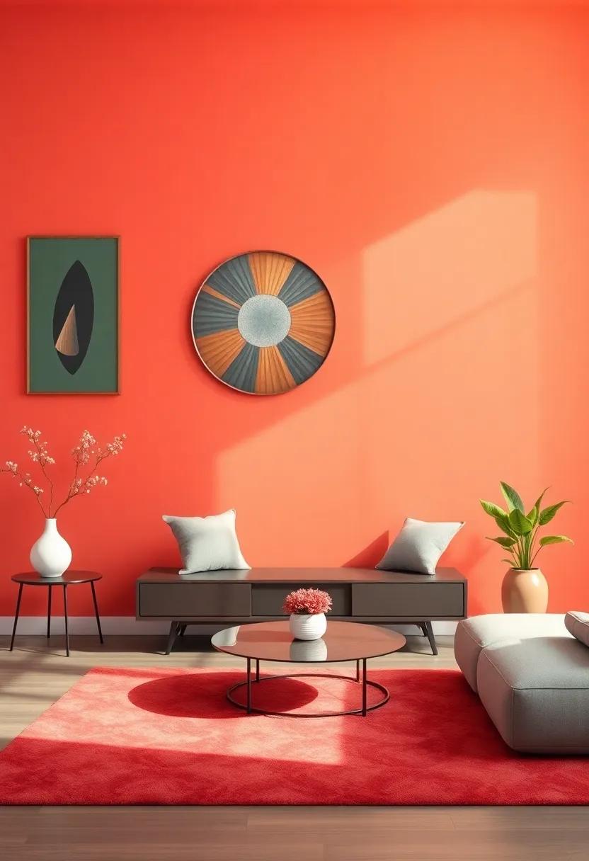
Lively Accent Walls: Making A Statement With Vibrant Color Choices
One of the most effective ways to infuse personality into a living space is by establishing a centerpiece with an accent wall that bursts with vibrant colors. Whether you choose a deep emerald green,a fiery coral,or a bright cerulean blue,the right hue can drastically change the vibe of your room,making it feel more inviting and alive. To create a harmonious balance, consider pairing your bold wall color with complementary or neutral tones in your furnishings and decor. This strategy ensures your accent wall stands out without overwhelming the space.
When selecting your color, think about the mood you aim to evoke. here are some creative options that can elevate your living area:
- Sunny Yellow: Evokes warmth and optimism.
- Rich Red: Inspires energy and passion.
- Calming Blue: Promotes tranquility and peace.
- Dynamic Orange: Enhances creativity and enthusiasm.
| Color | Emotion | Best Complement |
|---|---|---|
| Yellow | Cheerful | Gray |
| Red | Passionate | White |
| Blue | Calm | Beige |
| Orange | Exciting | Brown |
Enhancing Natural Light: Choosing Colors That Brighten Up Your Space
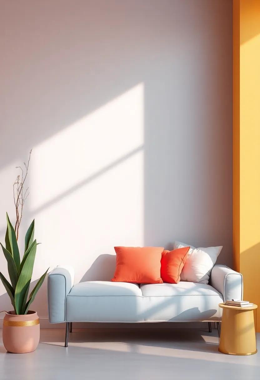
When it comes to maximizing natural light in your living room, choosing the right colors can make a important difference.light hues such as soft whites, pale grays, and pastel shades can reflect sunlight, creating an airy and inviting atmosphere. Additionally, colors like sky blue and mint green can evoke a sense of calm while enhancing the brightness of the space. To ensure your walls work harmoniously with your furnishings, consider pairing these light tones with light wood finishes or minimalist decor, which will seamlessly integrate into the overall aesthetic while amplifying the natural light that pours in.
To further enhance the light in your living space, you might want to explore the following accent colors that complement brighter walls and infuse personality into your room:
- Sunshine Yellow: Adds warmth and energy.
- Crisp Coral: Infuses vibrancy without overpowering.
- Lavender: Introduces a soft contrast, promoting relaxation.
- Silver Sage: A muted yet uplifting choice that pairs well with neutrals.
Consider creating a fast reference table for your vibrant living room options:
| Color | Effects | Best Paired With |
|---|---|---|
| Soft White | Brightens and expands | Light woods, greens |
| Pale Gray | Modern and tranquil | Blue, silver accents |
| Sky Blue | Fresh and serene | White trim, earth tones |
| Mint Green | Refreshing and uplifting | pastel furnishings |
Earthy Tones And Nature-Inspired Colors: Bringing The Outdoors In
Incorporating earthy tones and nature-inspired hues can transform your living space into a tranquil retreat that echoes the beauty of the outdoors. Colors such as deep greens, warm browns, and soft terracottas evoke feelings of serenity and connection to nature, creating a harmonious backdrop for your home. Consider the soothing effect of a muted olive green on one wall or a sandy beige that mimics the warmth of sunlit soil. These colors not only enhance the aesthetic appeal of your living room but also promote a sense of calm and comfort, inviting you to relax and unwind.
To truly embody the essence of nature within your home, think about complementing your walls with thoughtfully selected decor and furnishings. Fill your space with elements inspired by the natural world, such as:
- Wooden furniture that adds warmth and richness
- Textured textiles in neutral shades for coziness
- Indoor plants to bring vibrant greenery indoors
- Natural fiber rugs for added comfort underfoot
By harmonizing these earthy wall colors with organic materials, you can effortlessly create a living room that feels both inviting and rejuvenating. Let the colors of nature guide your choices, ensuring that each element in the room contributes to a cohesive, serene ambiance.
The Role Of Texture In Complementing Vibrant Wall Colors In Living Rooms
In a living room adorned with vibrant wall colors, texture plays a crucial role in balancing the boldness and adding depth to the design. By incorporating various textured elements,such as fabrics,wall treatments,and accessories,you can create a harmonious environment that draws the eye without overwhelming it. Consider layering textures through:
- textiles: Soft cushions and throws in contrasting yet complementary fabrics can soften vibrant hues.
- Wall Treatments: Techniques like wainscoting, shiplap, or plaster finishes can add richness and visual interest.
- Accessories: Wooden or metallic accents in decor can provide a tactile contrast to smooth, bright walls.
The interplay between vibrant colors and rich textures can transform a living room into a cohesive and inviting space. When selecting textures, consider using a combination of matte and glossy finishes to enhance the visual dynamics. For example, in a room painted in a bold teal, pairing it with warm, woven fabrics and metallic light fixtures can create an engaging atmosphere. Here’s a quick look at how different textures complement vibrant colors:
| Texture Type | Complementary Color Example | Effect |
|---|---|---|
| Velvet | Coral | Adds luxury and depth |
| Rattan | Mustard Yellow | Brings warmth and organic appeal |
| Satin | Electric Blue | Creates a sophisticated contrast |
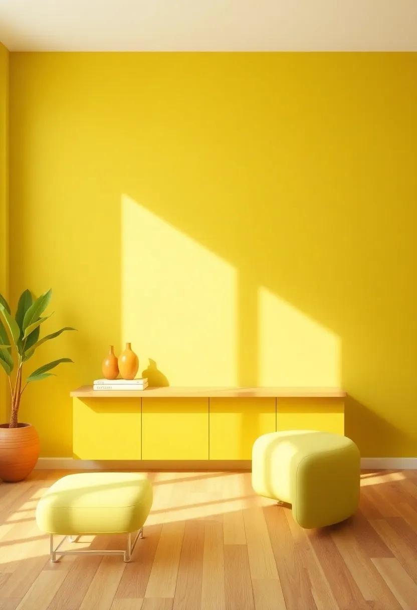
Creating Cozy Atmospheres With Warm Color Choices In Living Spaces
When it comes to creating inviting living spaces, the choice of wall color plays a crucial role in setting the mood. Opting for warm hues like soft yellows, rich oranges, and deep reds can instill a sense of comfort and togetherness. These colors not only invite warmth but also visually expand the space, making it feel more approachable. consider incorporating these tones through various methods:
- Accent Walls: Choose one wall to be painted in a vibrant shade while keeping the others neutral to create balance.
- Textured Paints: Use techniques like sponging or rag rolling to add depth and interest to the color.
- Soft Finishes: Consider matte or eggshell finishes for a sophisticated look that softens the glow of warm colors.
A well-coordinated palette can enhance the overall aesthetic significantly. To achieve a beautifully cohesive appearance, pair warm colors with complementary tones that allow the warmth to shine without overwhelming the senses. A thoughtfully arranged color scheme can be summarized in a simple chart:
| Warm Color | Complementary Color |
|---|---|
| Soft Yellow | Pale Grey |
| Earthy Terracotta | Cool Teal |
| Warm Burgundy | Dusty Rose |
By carefully selecting your palette and applying these layers of color, you can transform your living room into a snug retreat that beckons relaxation and connection.
Cultural Inspirations: Infusing Global Color Trends Into Room Designs
Incorporating global color trends into your living room can create a vibrant atmosphere that reflects diverse cultures and traditions. Explore the captivating tones inspired by the landscapes and art from around the world. Consider these inspiring colors that have their roots in rich cultural heritage:
- Turquoise: Reminiscent of Caribbean waters, this hue brings a sense of tranquility and freshness.
- Terracotta: With its earthy undertones, it evokes the warmth of Mediterranean villages.
- Mustard Yellow: A nod to the vibrant markets of India, this energetic shade enhances positivity.
- Royal Blue: Inspired by conventional Middle Eastern ceramics, it adds a touch of luxury and depth.
When designing your living space, blend these colors using an eclectic approach that harmonizes different cultural elements. Consider creating a color palette table to visualize your room’s aesthetic:
| Color | Inspired By | Emotion |
|---|---|---|
| Turquoise | Caribbean Waters | Tranquility |
| Terracotta | Mediterranean Villages | Warmth |
| Mustard Yellow | Indian Markets | Positivity |
| Royal Blue | Middle Eastern Ceramics | Luxury |
By harmonizing these vibrant shades with accessories and furniture from various cultures, you can curate a space that tells a story while stunning anyone who enters. Embrace the beauty of diversity in your design choices, and transform your living room into a global sanctuary of color and creativity.
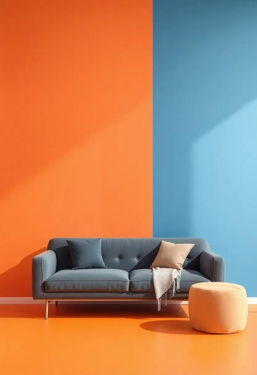
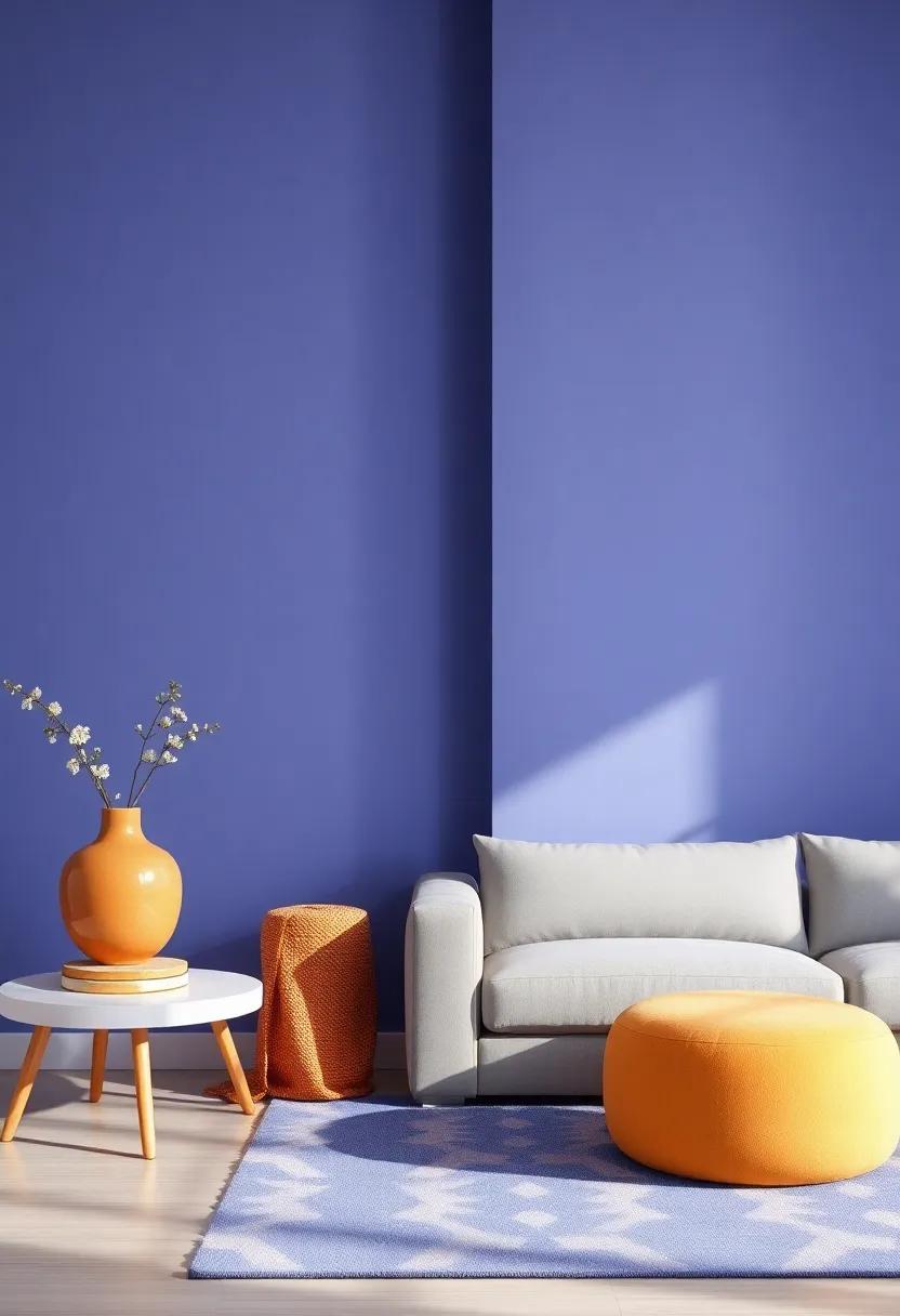
Contrast And complement: Exploring Color Pairings For Dynamic Walls
When it comes to designing vibrant walls, understanding the art of contrast and complement can make all the difference. Using a bold color in tandem with a muted hue can create a stunning visual impact.For those looking to add depth and intrigue, consider pairing colors like rich navy with soft blush or a vibrant mustard with calming gray. These combinations not only catch the eye but also create a cozy atmosphere that invites conversation. Use these principles to highlight specific areas, such as an accent wall, artworks, or architectural features, achieving both harmony and striking appeal.
To help you visualize effective color pairings, here’s a quick reference table showcasing dynamic options:
| Primary Color | Complementing Color | Effect |
|---|---|---|
| Coral | Teal | Vibrant and Refreshing |
| charcoal | Mustard | Warm and Bold |
| Emerald Green | Soft Peach | Elegant and Calming |
| Deep Plum | Gold | Luxurious and Sophisticated |
Utilizing these complementary and contrasting colors not only enhances the aesthetic of your living room but also sets the mood and defines your style. Experiment with various shades and textures to find the perfect balance that resonates with your personal taste, ensuring that your space is not just visually appealing, but a true reflection of who you are. Dive into the world of colors and let your walls speak volumes!
Seasonal Changes: adapting Wall Colors To Reflect The Mood Throughout The Year
As the seasons change,so to can the energy within your home. The transition from the bright, energetic hues of summer to the warm, earthy tones of autumn can be beautifully reflected through your wall colors. During spring, embrace soft pastels and nature-inspired greens that evoke a sense of renewal and freshness. As the leaves begin to change in fall, transition to deep oranges and rich browns, creating a cozy atmosphere perfect for gatherings. winter calls for cool blues and whites that mimic the serene beauty of a snowy landscape, while summer invites vibrant yellows and bright coral to enhance the feeling of warmth and openness in your living room.
By thoughtfully selecting your wall colors in harmony with the seasons, you can create a dynamic, welcoming environment.Consider the following suggestions for a seasonal palette that reflects the mood throughout the year:
- Spring: Light lavender, mint green, and soft peach
- Summer: Bright turquoise, sunny yellow, and coral
- Autumn: Warm mustard, pumpkin orange, and burgundy
- Winter: Icy blue, silver gray, and deep evergreen
| Season | Suggested Wall Color | Feeling Evoked |
|---|---|---|
| Spring | Soft Pastels | Renewal & Freshness |
| Summer | Vibrant hues | Joy & Energy |
| Autumn | earthy Tones | Cozy & Comfortable |
| Winter | Cool Colors | Serenity & Calm |
Focal Points: Using Bold Colors For Architectural Features And Highlights
Incorporating vibrant hues into architectural features can significantly elevate the aesthetic of any living space. by emphasizing elements such as archways, moldings, and crown details, bold colors create a dynamic contrast that draws the eye. Consider using deep blues or rich greens to highlight structural elements against lighter walls, generating a stunning visual interplay. Below are some ideas for achieving a striking look:
- Accent Walls: Paint one wall a vibrant color to serve as a backdrop for artwork or furniture.
- Structural Features: Highlight beams or columns in contrasting tones to enhance their visibility.
- Baseboards and Trim: Use a bold color for baseboards to create a unique touch that defines the space.
When applied thoughtfully, bright colors can transform mundane areas into focal points, allowing them to showcase the architecture of your home. to make the most impact,consider utilizing a carefully curated palette,which can include complementary colors that harmonize with existing furniture and decor. A well-strategized combination could involve:
| Color | Effect |
|---|---|
| Crimson Red | Invokes energy and warmth, perfect for a cozy living room. |
| Sunshine Yellow | Creates an uplifting atmosphere, ideal for well-lit spaces. |
| Ocean Blue | Brings tranquility and a sense of calm to indoor environments. |
DIY Wall Art Ideas To Enhance The Vibrancy Of Your Living Room Colors
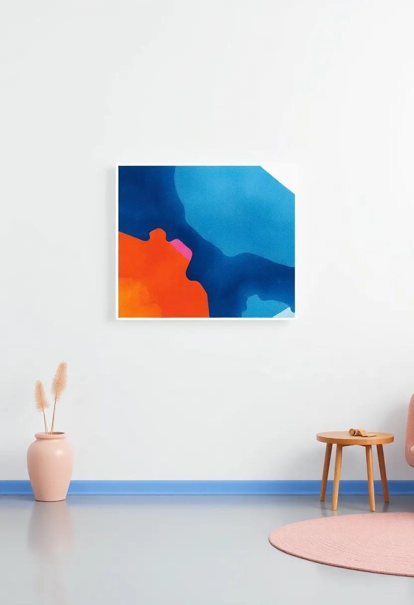
Infusing your living room with vibrant wall art can dramatically elevate its ambiance and reflect your personal style.Consider creating a gallery wall that mixes mediums and textures; you’ll find that combining canvas paintings, framed prints, and textiles can create a dynamic focal point. Use a cohesive color palette drawn from your wall hues to ensure harmony.Think about incorporating 3D elements like wooden wall hangings or metal sculptures to add depth and interest.Don’t overlook the power of DIY projects: a hand-painted mural or a series of oversized abstract pieces can be transformative and highly individualized.
To ignite creativity in your living room, explore ideas such as using stencils for geometric patterns, or making collages from meaningful photographs and artwork. Utilize reclaimed materials for an eco-friendly twist that tells a story. If you’re looking to add a splash of playful color without a complete overhaul, consider crafting colorful macramé hangings or framed fabric swatches that resonate with the main color scheme. Here are some popular DIY wall art ideas you can experiment with:
- Watercolor Wash: Use soft hues to create a gradient effect.
- Framed Mirrors: Reflect light and create the illusion of more space.
- fabric Panels: bold prints can introduce texture.
- Photo String Art: Combine personal pictures with craft supplies for a unique display.
Sustainable Choices: Eco-Friendly paints For A Healthier Living Environment
When embarking on a journey to revamp your living room with vibrant wall colors, considering your choice of paint can significantly impact not only the aesthetics but also your health and the environment. Eco-friendly paints, crafted from natural ingredients, free of harmful volatile organic compounds (VOCs), offer a sustainable alternative to traditional options.By selecting these greener formulations, you contribute to a healthier indoor air quality while showcasing beautiful colors that can transform your space into a sanctuary. Options such as clay,organic pigments,and water-based formulas help you create an inviting atmosphere without compromising your values.
Moreover, with advancements in eco-paint technology, a variety of bold and refreshing hues are now readily available. Sustainable paints come in an array of finishes and textures, allowing homeowners to personalize their living rooms seamlessly. Some benefits of opting for these eco-friendly choices include:
- Reduced environmental impact: Biodegradable ingredients minimize waste.
- Improved air quality: Low or zero VOCs promote healthier indoor conditions.
- Durability and longevity: Many eco-friendly paints last longer on walls, reducing the need for frequent touch-ups.
For those considering making the switch,here’s a quick comparison of popular eco-friendly paint brands:
| Brand | Type | Special Features |
|---|---|---|
| Behr Premium Plus | Low VOC | Available in a wide range of colors |
| Benjamin Moore Natura | Zero VOC | Ultra-low odor and washable |
| ECOS Paints | Natural | Non-toxic and environmentally friendly |
Lighting Effects: How different Light Sources Change The Perception Of Color
Lighting plays a crucial role in how we perceive color within our homes,notably when it comes to wall hues. Different light sources—such as natural sunlight, incandescent bulbs, and fluorescent lights—each cast unique qualities that can dramatically alter the ambiance of a room. For instance,natural light often enhances a color’s vibrancy,making warm tones like yellows and oranges feel even more inviting. In contrast, incandescent bulbs create a soft, warm glow that can make cooler shades appear more muted and subdued.
Additionally, the effect of artificial lighting can be predicted based on the color temperature of the light. Key factors include:
- Warm light (below 3000K): Enriches reds and oranges, fostering a cozy atmosphere.
- neutral Light (3000K – 4000K): Presents colors more accurately, enhancing their true essence.
- cool Light (above 4000K): Elevates blues and greens, resulting in a crisp, sharp feel.
For a more detailed comparison, consider the table below that illustrates how various light sources influence popular wall colors:
| Light Source | Color Impact |
|---|---|
| Natural Light | Brightens and enhances vibrancy |
| Incandescent | Softens colors, adds warmth |
| Fluorescent | Can wash out tones, highlights cooler colors |
The psychology Of Color: How Vibrant Shades Influence Our Daily Lives
Colors have an undeniable impact on our emotions and behaviors, often acting as invisible agents that shape our daily experiences. When it comes to interior design, particularly in lively spaces like living rooms, the right hue can elevate your mood and create an inviting atmosphere. For example, vibrant blues can instill a sense of calmness, while energetic oranges spark creativity and sociability. By harnessing the psychological effects of color, you can curate a space that resonates with your personality and desired ambiance.
Consider incorporating a variety of colors through decorative elements such as accessories, artwork, and accent walls. Here are some ideas to explore:
- Bright yellows for a cheerful vibe
- Deep reds to foster intimacy and warmth
- Lively greens to connect with nature and promote tranquility
- Dynamic purples that inspire creativity and luxury
The table below summarizes the emotional responses associated with popular vibrant colors to help guide your decorating choices:
| Color | Emotion | Best Used In |
|---|---|---|
| Yellow | Happiness | Kitchens, Playrooms |
| Red | Passion | Dining Areas, Living Rooms |
| Green | Calm | Bedrooms, reading Nooks |
| Blue | Peace | home Offices, Relaxation Spaces |
Timeless Vibrancy: Classic Color Combinations That Never Go Out Of Style
In the realm of interior design, certain color pairings possess an enduring appeal that can instantly elevate the atmosphere of any living space.Navy blue and gold create a luxurious contrast, bringing a sense of sophistication and warmth.Meanwhile, the combination of sage green and cream evokes tranquility, making it perfect for creating a serene oasis in your living room. Other eye-catching pairings include:
- Charcoal gray and blush pink for a modern twist
- Mustard yellow and deep teal for a vibrant pop
- Classic black and white for a timeless aesthetic
- Rust orange and olive green for a warm, earthy vibe
Choosing the right color combination is essential, as it can dictate the mood of your living room. A maritime palette featuring shades of blues and sandy beiges can impart a refreshing coastal feel, while a rich jewel-tone scheme with emerald greens, royal purples, and sapphire blues invites opulence. Consider the subtle interplay of color and light; if your room is well-lit, bolder colors can shine without overwhelming the space. Here’s a simple table displaying some timeless color combinations and their effects:
| Color Combination | effect |
|---|---|
| Navy Blue & Gold | luxurious & Elegant |
| Sage Green & Cream | Calm & Inviting |
| Charcoal Gray & Blush Pink | Chic & Modern |
| Mustard Yellow & deep Teal | Bright & Playful |
Creating Harmony: Blending Vintage Finds With Modern Colors For Cozy Spaces
Incorporating vintage finds into modern design creates an inviting atmosphere that reflects your personality and history. Imagine pairing a vibrant teal accent wall with a rustic oak sideboard, or a deep burgundy backdrop that enhances the charm of a distressed leather armchair. These color combinations not only highlight the story behind each vintage piece but also bring a sense of warmth and nostalgia to your space.Consider these complementary elements for a successful blend:
- Color Contrast: Pair soft, muted vintage pieces with bold wall colors to create visual interest.
- Texture Play: Combine smooth, modern finishes with the textured surfaces of vintage items for a dynamic feel.
- Eclectic Accessories: Use colorful modern decor to accentuate the uniqueness of vintage finds.
To achieve that harmonious balance, focus on using a restrained color palette that allows both vintage and modern elements to coexist seamlessly. A warm mustard yellow wall could beautifully accentuate a cool-toned vintage artwork,while a soft sage green might provide a soothing backdrop for a collection of antique trinkets. Consider the following table to guide your selection:
| Vintage style | Modern Color Palette | Suggested Accessories |
|---|---|---|
| Mid-Century Modern | Coral and Teal | Abstract art, Geometric Rugs |
| Shabby Chic | Soft Grey and Dusty Rose | Floral print Cushions, Wicker Baskets |
| Industrial | Charcoal and Olive Green | Metal Accents, Plant Stands |
Visual Storytelling: Using Color To Narrate Your Living Room’s Unique Style
Color is not just a design element; it’s a powerful storytelling tool that can bring your living room to life.By using different hues and shades, you can create an atmosphere that reflects your personality and lifestyle. Bold reds can evoke passion and energy,while soft blues might offer tranquility and calm. Consider how these colors interact not only with one another but also with the natural light your space receives throughout the day. A striking accent wall can serve as an eye-catching focal point, guiding the narrative of your room and inviting interaction.
To effectively harness the potential of color, think about the themes you wish to portray.here’s a quick rundown of some popular choices that can narrate your living room’s unique story:
| Color | Mood |
|---|---|
| Emerald Green | Growth & nature |
| Sunny Yellow | Joy & Energy |
| Creamy Beige | Warmth & Comfort |
| Muted Gray | Sophistication & Calm |
These choices can definitely help define the design language of your space. Pair colors with complementary accessories—think pillows, rugs, and artwork—to cement your vision. Remember, the beauty of color lies in its ability to shift perception, inviting guests into an experience rather than just a room.Choose wisely,and let the colors weave the tale of your living space.
Personalized Expression: Tailoring Wall Colors To Reflect Your Individual Style
When it comes to choosing wall colors, personalization is key. Your living room should be an extension of your personality, embodying the essence of your style. To create a space that feels uniquely yours, consider factors such as lighting, furniture styles, and artwork when selecting hues. A soft lavender can evoke tranquility, while a vibrant teal might inspire creativity and energy. By experimenting with different shades and finishes, you can curate a color palette that tells your story and transforms your living space into a reflection of your individual flair.
Moreover, the emotional impact of color cannot be underestimated.Warmer tones like sandy beige or muted coral can induce a feeling of warmth and comfort, perfect for fostering relaxation and conversation. In contrast, cooler tones such as dusty blue or forest green seem to expand space and promote clarity. To better visualize how each option aligns with your personal sense of style, consider creating a simple mood board. This visual collage can incorporate color swatches, texture samples, and images that resonate with you, offering a tangible way to assess how the chosen colors bring your vision to life.
| Color Emotion | Suggested Shades |
|---|---|
| comforting | soft Beige, Warm Coral |
| Serene | Dusty Blue, Lavender |
| Inviting | Sunny Yellow, Light Peach |
| Energetic | Vibrant Teal, bold Marigold |
| Balanced | Forest Green, Calm Gray |
Unexpected combinations: How To Pair Unconventional Colors For Stunning Effects
Exploring unconventional color combinations can unlock a world of creativity in your living room.Consider pairing mustard yellow with a deep teal; the warmth of the yellow contrasts beautifully with the cool tones, creating a dynamic and inviting atmosphere. Another striking combination is coral and navy blue.While coral adds a playful touch, the navy provides sophistication, ensuring a balanced yet vibrant space. For a more subdued approach,try mixing earthy olive green with soft lavender. This combination brings a natural tranquility,making your living room not only stylish but also a serene retreat.
To further inspire your design choices, here’s a quick reference table showcasing some unexpected color pairs and their emotional impacts:
| Color Pairing | Emotional Impact |
|---|---|
| Mustard Yellow & Teal | Vibrant Energy |
| coral & Navy Blue | Playful Sophistication |
| Olive Green & Lavender | Natural Tranquility |
As you experiment with these unique hues, remember that the key lies in balance. creating visual interest is all about the right proportions. Whether you choose an accent wall or bold furniture, selecting the right accessories in complementary shades can harmonize your aesthetic. Add pillows in burnt orange next to a cool gray sofa, or perhaps use mint green and chocolate brown decor for a refreshing yet grounded look. These unexpected pairings result in eye-catching elements that transform your living space into a stunning representation of your unique style.
From Drab To Fab: Transforming Your Living Room With Bold Color Choices
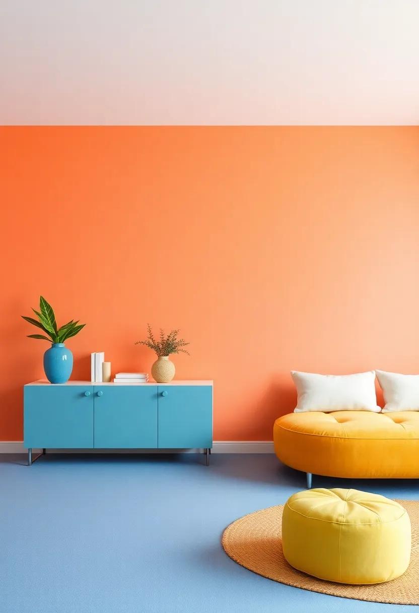
Injecting life into your living room can be as simple as selecting the right wall colors. Bold hues not only capture attention but also evoke emotions and create a lively atmosphere. When choosing a vibrant color, consider how it interacts with your space’s natural light and existing furnishings. Popular options include:
- Cerulean Blue: Evokes calmness and serenity, reminiscent of clear skies.
- Vibrant Coral: A cheerful tone that adds warmth and energy.
- Rich Emerald Green: Brings a touch of nature indoors, promoting a refreshing ambiance.
- Sunny Yellow: infuses cheerfulness, perfect for brightening up any corner.
Pairing these bold colors with complementary accents can elevate your design even further. Consider using statement furniture and decor pieces that harmonize with your chosen palette. Examples of complementary color pairings include:
| Wall Color | complementary Accent Colors |
|---|---|
| Cerulean Blue | Soft Grey and White |
| Vibrant Coral | Turquoise and Cream |
| Rich Emerald Green | Gold and Neutral Beige |
| Sunny Yellow | Charcoal and Light Blue |
With thoughtful color choices and accent pairings, your living room can seamlessly transform from drab to dazzling, showcasing your unique style while offering a welcoming environment for family and friends.
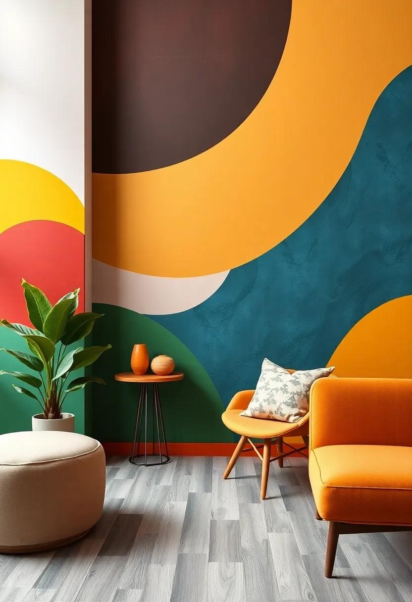
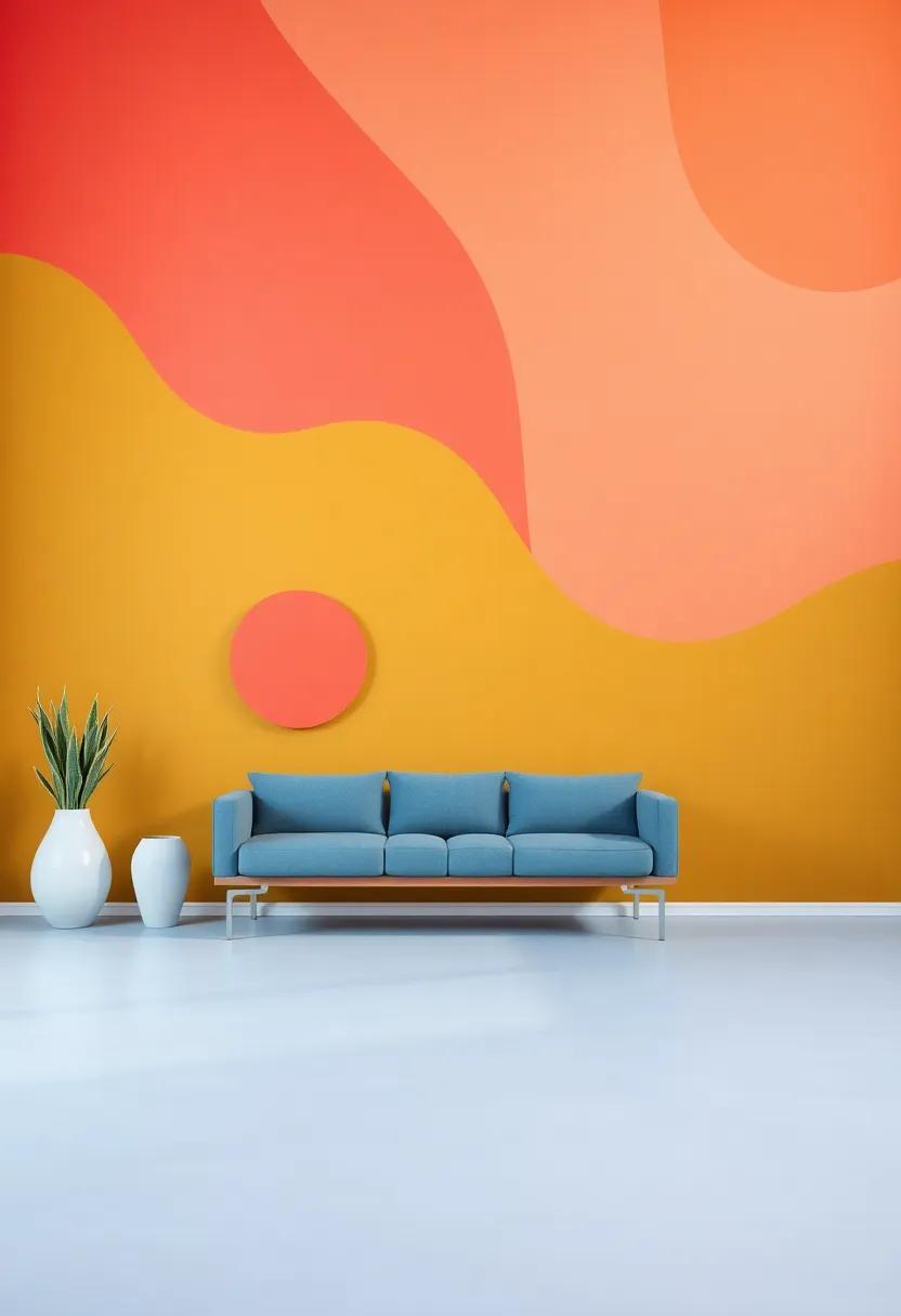
Exploring Geometric Patterns And Vibrant Colors For Contemporary Appeal
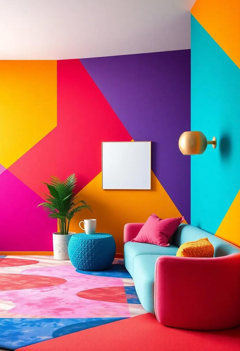
Infusing your living space with geometric patterns can create a sophisticated yet playful ambiance that captivates anyone who walks through the door. Bold shapes and striking lines can be seamlessly integrated into wall designs, textiles, and even furniture to form an eye-catching focal point. Imagine a feature wall adorned with a geometric mural in colors like electric blue or sunset orange, paired with complementary decor elements that emphasize these shapes. The interplay of light and shadows cast by these designs adds depth, inviting exploration and engagement with the space.
Vibrant hues elevate these angular elements, allowing for a dynamic interplay between color and form. Consider a palette that incorporates rich teal, deep mustard, and fiery coral to create a harmonious yet eclectic environment. By layering these tones, you can achieve a balanced aesthetic that feels both modern and inviting. Try adding decorative elements such as throw pillows, area rugs, or art pieces that feature similar patterns in soft and bold tones to create continuity throughout the room.Here’s a quick guide to help you visualize how to pair colors and patterns effectively:
| Pattern Type | Color Pairing | Recommended Decor |
|---|---|---|
| Geometric Lines | Electric Blue & White | Accent Chair, Wall Art |
| Chevron | Deep Mustard & Charcoal | Area Rug, Throw Blanket |
| Abstract Shapes | Fiery Coral & Soft Gray | Cushions, Table Accessories |
Layers Of color: Building Depth And Interest With Multiple Shades In One Room
When it comes to infusing a living room with personality, exploring the interplay of multiple shades can significantly elevate the aesthetic. Layering colors creates a dynamic visual experience that engages the eye, allowing each hue to complement the others while also standing out in its own right. Start by establishing a dominant base color that sets the overall mood of the space. from there, introduce accent walls or colored furniture pieces that showcase additional tones, weaving an intricate tapestry of shades that invite warmth and contrast.
Consider using accessories like pillows, art, and rugs to echo the diverse palette you’ve created. Here are some ideas to implement this technique effectively:
- Choose a Balanced Palette: Aim for three to five shades that harmonize well together.
- Create a Focal Point: Use a bold color for one wall or a statement piece to draw attention.
- Mix Textures: Combine different materials to amplify the richness of your color layers.
| Base Color | accent Shade | Ideal Textures |
|---|---|---|
| Warm Taupe | Dusty Blue | Soft velvet |
| Charcoal Gray | Mustard Yellow | Rugged Linen |
| Lavender | Deep Forest Green | Natural Wood |
Color Trends You might Not Have Considered For A Fresh Living Room Look
If you’re looking to breathe new life into your living room, exploring unconventional color trends can lead to stunning transformations. Consider rich jewel tones such as emerald green or sapphire blue.These deep colors can create a sense of luxury and elegance, making your space feel both inviting and exclusive. Pair them with metallic accents or natural wood elements to balance their intensity while adding a touch of sophistication.
In addition, pastel shades are making a strong comeback, offering a fresh and lighthearted vibe that can uplift any space. Light lavenders, soft peaches, and muted sage greens are perfect choices for creating a serene and tranquil atmosphere. These soft hues work wonderfully with white or creamy furniture, providing a gentle contrast that enhances the overall aesthetic. To accentuate the playful nature of pastels, consider incorporating textured fabrics and cheerful decor elements that complement this cheerful palette.
| Color Trend | Vibe | Best Paired With |
|---|---|---|
| Emerald Green | Luxurious | Metallics, Natural Woods |
| Sapphire Blue | Elegant | Whites, Creams |
| Lavender | Serene | Light Grays, Whites |
| Sage Green | Tranquil | Neutrals, Pastels |
| Peach | Cheerful | Greys, Soft Blues |
Key Takeaways
the power of color is undeniable, especially when it comes to transforming your living space into a captivating haven. whether you choose a bold cerulean to spark creativity or a warm terracotta for comforting warmth, the hues on your walls can set the tone for every gathering and quite moment alike. As you explore the spectrum of vibrant wall colors, remember that the ultimate goal is to create an environment that resonates with your personal style and enhances your daily living. So, take a leap into the world of color, embrace the transformative potential at your fingertips, and watch as your living room evolves into a stunning reflection of who you are. your walls are waiting—let them tell your story!
As an Amazon Associate I earn from qualifying purchases.