

when it comes to transforming a bathroom from a mundane necessity into a personal sanctuary, the interplay between color and texture plays a crucial role. While patterned tiles can serve as stunning focal points, the challenge lies in choosing wall colors that not only complement these intricate designs but also enhance the overall ambiance of the space. In this article, we’ll explore a curated selection of innovative wall color ideas that harmonize beautifully with a variety of patterned tiles. Whether your style leans towards the bold and vibrant or the soft and serene, these creative suggestions will inspire you to reimagine your bathroom as a reflection of your unique taste and personality. Let’s dive into the colorful world of bathroom design where walls and tiles come together in perfect harmony.
Transforming a Small Bathroom with Bold Color Choices That Pop Against Intricate Tiles
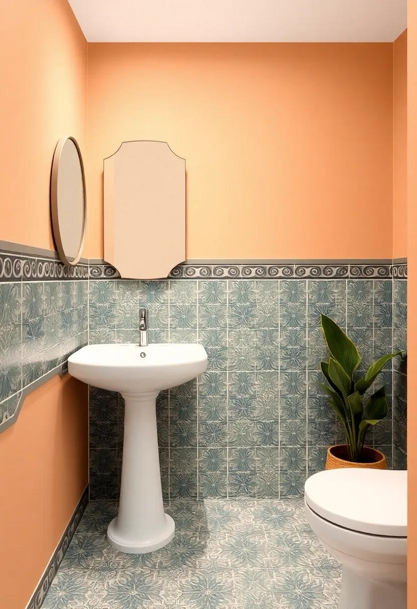
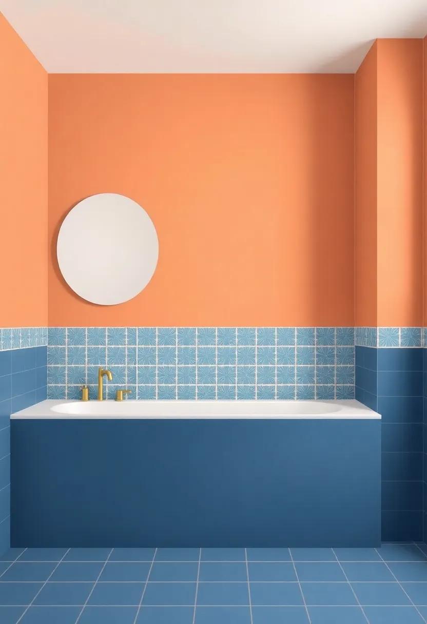
When transforming a small bathroom, the right color choice can breathe new life into your space, creating a striking contrast against intricate tiles. Bold hues like deep teal or vibrant coral can enhance the visual interest of patterned tiles, drawing the eye without overwhelming the space. These colors not only make a statement but also evoke a sense of warmth and coziness. To ensure that your bold choice harmonizes with the tiles, consider accessorizing with complementary shades in your towels and decor, opting for items that echo the tile colors while providing balance.
In addition to paint,think about the placement of color on your walls. One effective technique is to use a bold accent wall that highlights a specific tile pattern while painting the remaining walls a softer neutral. this dual-tone approach allows for creative expression without compromising the intricate design of the tiles. Here are some ideas to consider:
- Accent Wall: Create a focal point behind a mirror or vanity to draw attention.
- Half-Wall Color Block: Paint the lower half a daring color while keeping the upper part airy
- Matching Trim: Use colors that pop for trim or details to tie the entire look together.
For a more organized visualization, here’s a simple table showcasing color choices and their complementary tile patterns:
| Color Choice | Complementary Tile Pattern |
|---|---|
| Deep Blue | Geometric White Pattern |
| Mustard yellow | Floral Ceramic Design |
| forest Green | Moroccan Motif |
| Dusty Rose | Subtle Stripes |
Sophisticated Neutrals: Harmonizing Soft Tones with Vibrant Tile Designs
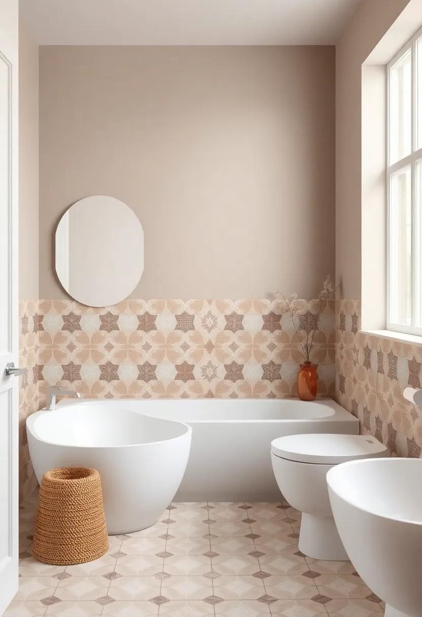
Achieving a seamless balance between soft hues and bold tile patterns can transform any bathroom into a sanctuary of style. to harmonize your space, consider using light taupe, soft beige, or gentle greys as your wall colors. These neutral shades serve as a perfect backdrop, allowing the vibrant tile designs to take center stage while contributing to a serene atmosphere. Pairing muted walls with tiles featuring intricate designs, such as geometric patterns or swirling mosaics, can elevate the overall aesthetic, creating a pleasing contrast that enhances both elements.
When venturing into this design journey, it’s essential to consider texture and finish. Opt for a matte or eggshell finish to complement your wall colors, providing subtle warmth that invites tranquility. Consider adding accents or moldings in similar muted tones to create continuity and draw attention to the tiles. Incorporating plants or natural wood elements can further enhance the cohesive look while introducing organic shapes and lines. The combination of sophisticated neutrals with vibrant tiles not only reflects your personal style but also creates a timeless elegance within your bathroom.
Embracing Monochrome: Creating a Chic Look with One Color Palette
Monochrome styles shine particularly shining in the bathroom,where space is frequently enough at a premium and simplicity can create an oasis of calm. Choosing a single color palette allows the beauty of patterned tiles to take center stage. For instance,a soft gray on the walls can complement a bold geometric tile,enhancing its visual impact without overwhelming the senses. Additionally, consider varying shades of the same color to add depth and interest. Accents like towels, bath mats, and even shower curtains can match these tones, creating a cohesive and sophisticated look.
To effectively embrace this approach,choose your primary color wisely. Here are some ideas for your monochrome palette:
- Soft Blue: Evokes feelings of tranquility, perfect for a spa-like retreat.
- Warm Beige: Creates a cozy atmosphere, harmonizing beautifully with rustic tile patterns.
- Bold Charcoal: Offers a dramatic contrast to light-colored tiles, adding sophistication and elegance.
- Subtle Sage: Brings in a touch of nature, complementing earthy tiles with charm.
When decorating, consider using an HTML table to visualize your choices more effectively:
| Color Choice | Impact | Tile Match |
|---|---|---|
| Soft Blue | Tranquil | White or Navy Patterns |
| Warm Beige | Cozy | Rustic or Earthy Tones |
| Bold Charcoal | Sophisticated | Light Pastels |
| subtle Sage | Natural | Floral or Leaf Patterns |
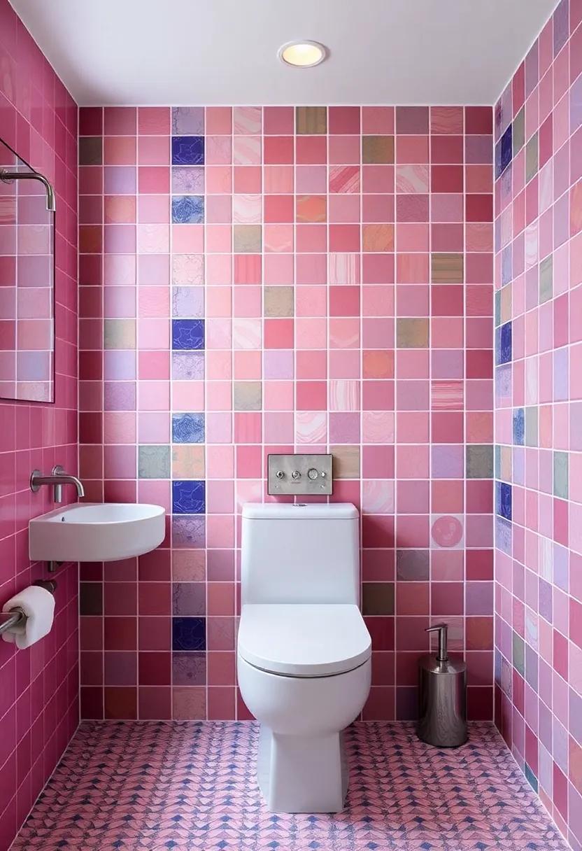
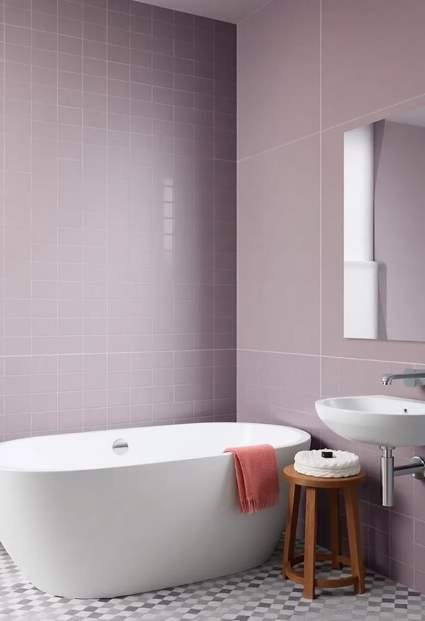
playful Pastels: Infusing Soft Hues for a Calming Atmosphere
Incorporating soft hues into your bathroom can be a transformative experience, turning a possibly stark space into a serene retreat. Choosing playful pastels such as powder pink, soft lavender, or gentle mint can create a stunning contrast against bold patterned tiles. These calming colors not only reflect light beautifully but also enhance the overall ambiance, contributing to a soothing surroundings. To achieve a harmonious look, consider using these hues on the walls, allowing the patterned tiles to become the vibrant visual focal point while the pastels serenely blend in.
When selecting pastel shades, keep in mind the overall theme and accessory choices in your bathroom. Complement your soft wall color with natural materials like wood and stone to evoke a tranquil spa-like feel. Here are a few ideas to inspire your palette:
- Powder Blue: Pairs wonderfully with floral or geometric tiles.
- Soft Peach: Offers warmth and can beautifully accentuate earthy tones.
- Mint green: Revitalizes space while harmonizing with darker colored tiles.
To visualize your options, you may create a simple color table:
| Color | Feeling | Perfect Pairing |
|---|---|---|
| Powder Blue | Calming | Floral Tiles |
| Soft Peach | Welcoming | Dark Stone |
| Mint green | Refreshing | Geometric Patterns |
Exploring Earthy Shades: Grounding Your Space with Rich Color Tones
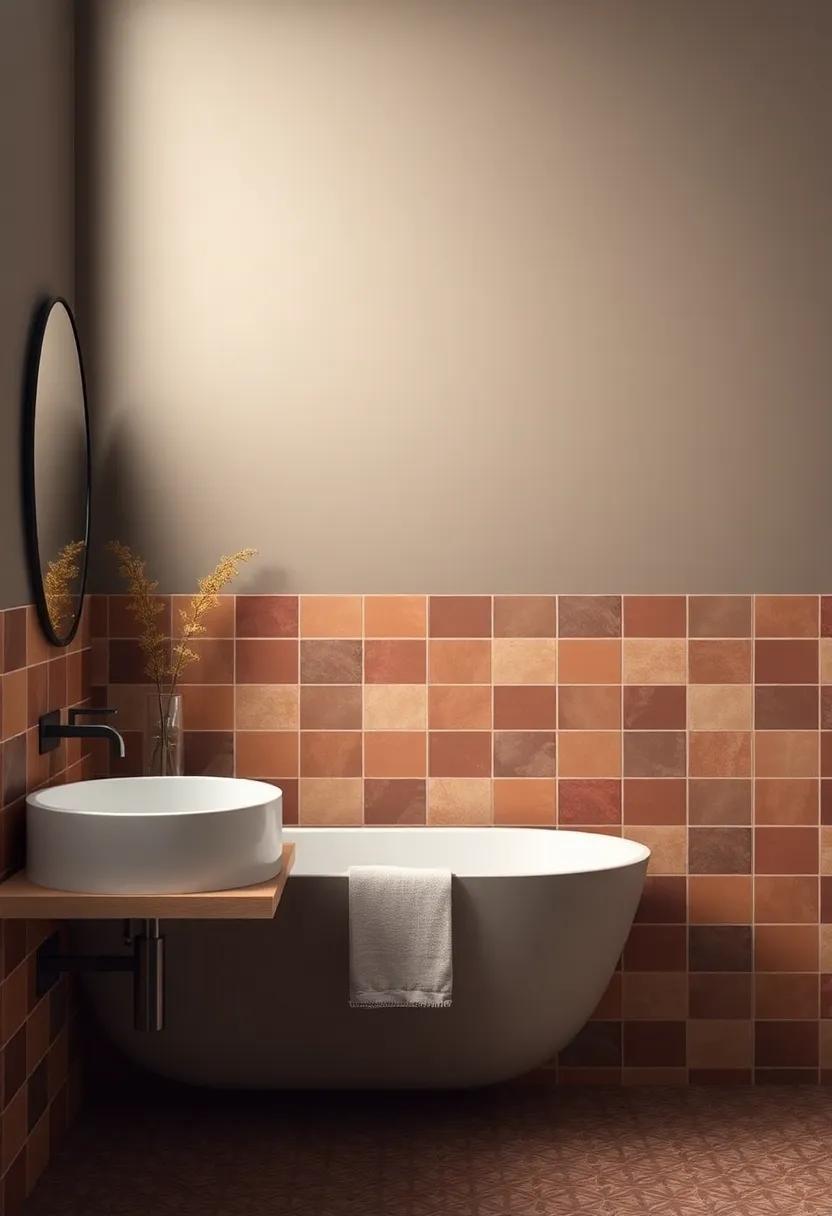
When it comes to creating a serene environment in your bathroom, earthy shades offer a perfect balance between coziness and elegance. Consider embracing tones like deep terracotta, soft olive, or rich clay to introduce a grounded essence.These hues pair beautifully with patterned tiles, allowing the complex designs to take center stage while creating a calming backdrop. Mixing and matching different earthy tones can also add depth and dimension, inviting warm, organic vibes into your personal retreat.
To enhance the aesthetic appeal, think about incorporating the following elements:
- accent Walls: Choose a bolder earthy color for one wall to create a focal point.
- Natural Materials: Pair paint colors with wooden accents or stone elements to maintain a cohesive look.
- Texture Play: Consider matte finishes for a softer feel or satin finishes to reflect light beautifully.
Preview your color options alongside your tiles using a simple color chart:
| Earthy Shade | Tile Pattern Compatibility |
|---|---|
| Deep Terracotta | Floral or Geometric |
| Soft Olive | subtle Stripes |
| Rich Clay | Moroccan Patterns |
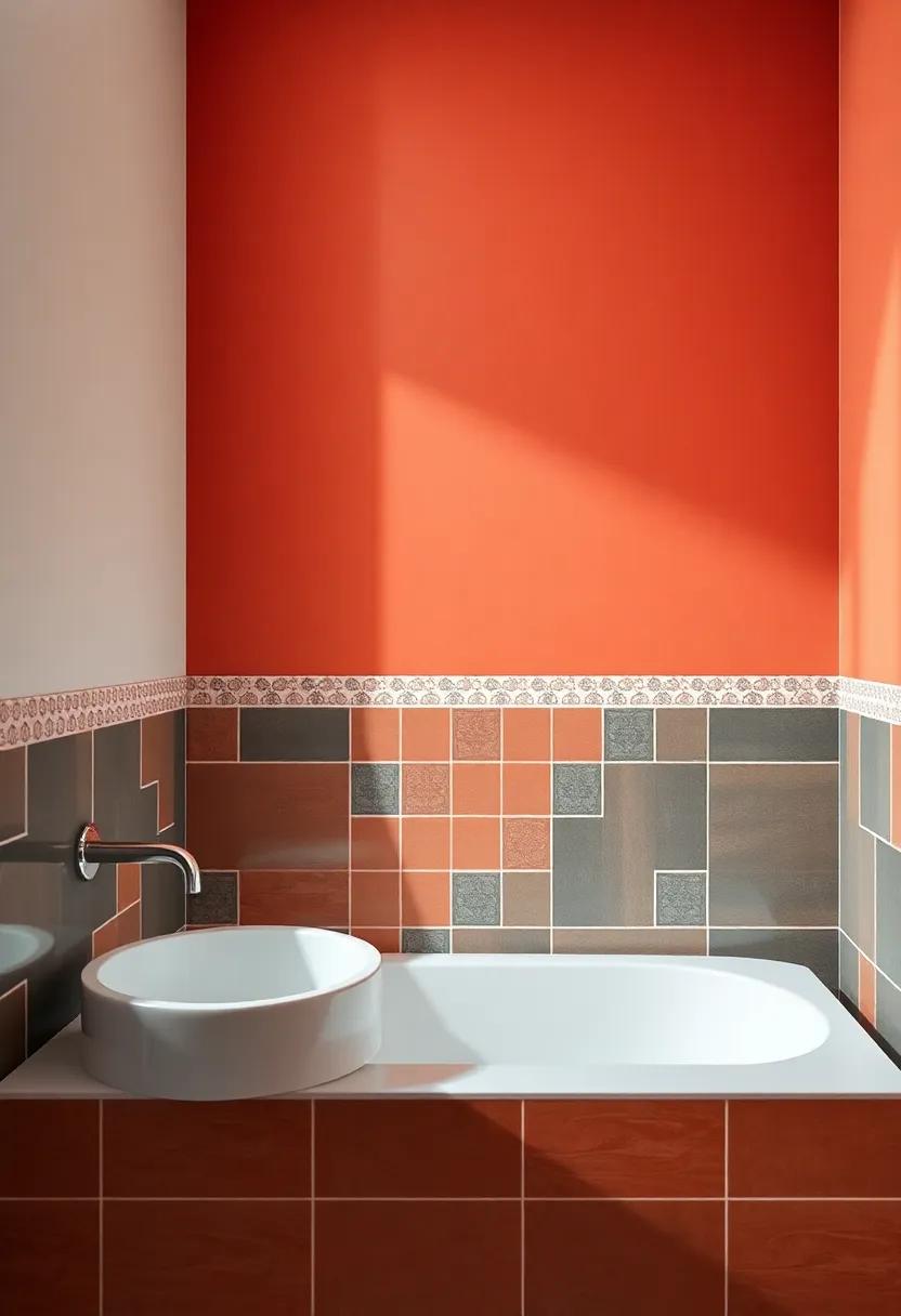
Bright Accents: Adding a Splash of Color to Balance Patterned Tiles
Bright accents can be the perfect remedy for the vibrant energy of patterned tiles, allowing them to shine while harmoniously tying together the overall color scheme of your bathroom. Consider integrating bold colors through painted wall sections, accessories, or even furniture to create a balanced aesthetic. Here are some color ideas to explore:
- Sunny Yellow - A cheerful hue that adds warmth and complements intricate tile designs.
- Turquoise – Evokes a tropical vibe, providing a stunning contrast against muted or earth-tone tiles.
- Coral – This lively shade brings a touch of playfulness while accentuating floral or geometric tile patterns.
- Deep Navy – A bold choice that can ground vibrant tiles, offering a sophisticated background without overshadowing them.
When applying splashes of color, consistency is key. Try selecting two or three accent shades from your tile’s color palette and disperse them evenly throughout the space. Accessory choices, such as towels, rugs, and artwork, can introduce these colors effortlessly. To visualize this concept, here’s a simple approach to mixing and matching colors with different patterned tiles:
| Tile Pattern | Accent Color | Accessory Suggestion |
|---|---|---|
| Floral Tiles | Pale Green | Leaf-patterned shower curtain |
| Geometric Tiles | Bright Orange | Striped towels |
| Art Deco Tiles | Rich Plum | Gold-framed mirrors |
Elegant Contrast: Using Darker Colors to Highlight Decorative Elements
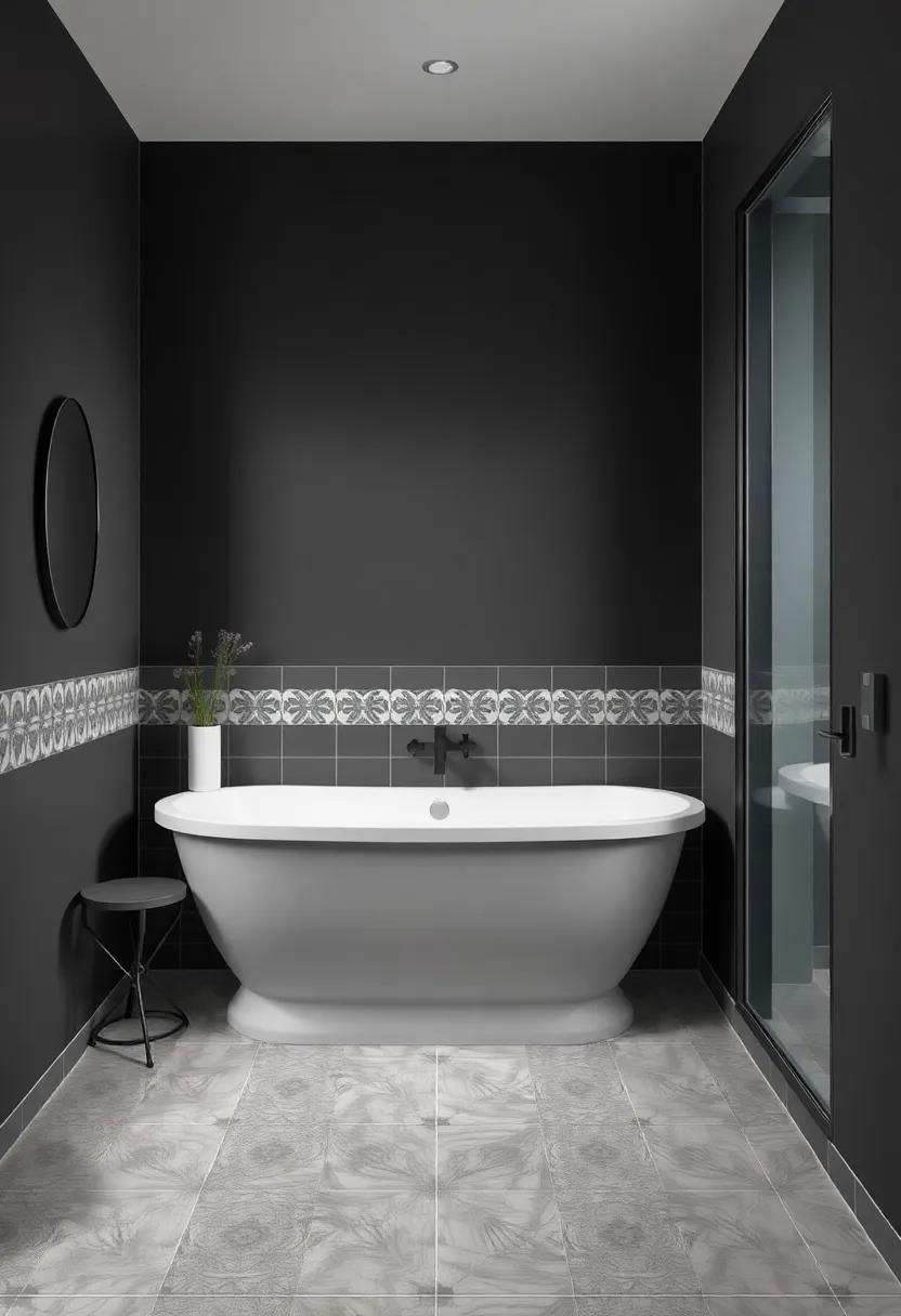
Incorporating darker hues into your bathroom design can create a striking backdrop that accentuates the vibrancy of patterned tiles. Rich colors such as deep navy, charcoal gray, or even a bold forest green can serve as a canvas, enhancing the intricate details of your tile work. Contrast is key here—the bolder the wall color, the more pronounced the decorative elements will appear, creating a visually captivating experience.consider pairing a dramatic wall color with metallic accents or warm wood tones to enrich the ambiance and add a layer of sophistication to your bathroom.
To further enhance the elegant contrast, you might choose accessories and fixtures that blend seamlessly with the darker walls while still allowing the tiles to shine. Here are a few elements to consider:
- Framed Mirrors: A large, ornate mirror with a metallic finish can draw the eye and reflect light.
- Light Fixtures: Opt for sleek, modern designs in brass or matte black that pop against darker shades.
- textured Linens: Soft towels and rugs in light or complementary shades can break the darkness, keeping the space cozy.
To help you visualize the combinations,here’s a brief table that outlines potential color pairings:
| Wall Color | Tile Color | Accents |
|---|---|---|
| Deep Navy | White Subway | Brass Fixtures |
| Charcoal Gray | Geometric Black & White | Glass accessories |
| Forest Green | Terracotta | Natural Wood |
Textured Walls: Bringing Depth to Your Design with Raised Patterns
Incorporating textured walls into your bathroom design can transform an ordinary space into a striking focal point. Choosing raised patterns not only adds a three-dimensional quality but also creates visual interest that enhances the overall aesthetic. When paired with vibrant tiles, textured walls allow for a myriad of combinations, encouraging you to explore colors that complement both the patterns and the spirit of the room.Consider options like geometric shapes,floral reliefs,or natural stone finishes that resonate with your personal style while concurrently inviting depth into your bathroom.
When selecting colors to harmonize with your patterned tiles, aim for hues that will accentuate the unique textures in your design. Here are some ideas to consider:
- Soft Neutrals: Beige or light gray can provide a warm backdrop that allows patterns to stand out.
- Bold Accents: deep blues or emerald greens can create a dramatic contrast that highlights textural elements.
- Pastel Shades: Soft pinks or mint greens can add a subtle touch of color that maintains a light and airy feel.
- Metallic finishes: Consider using a shimmering coat or wallpaper for an opulent affect that enhances raised designs.
To help visualize your options, here’s a simple table showcasing color ideas alongside their potential impact:
| color | Effect |
|---|---|
| Soft Neutrals | Warm and inviting atmosphere |
| Bold Accents | Creates a dramatic focal point |
| Pastel Shades | Brightens the space while remaining subtle |
| Metallic Finishes | Opulent and sophisticated touch |
Creating Focal Points: Bold Color Choices Around Feature Tiles
To make your feature tiles truly stand out, consider incorporating vivid color choices for the surrounding walls. Colors like vibrant teal, warm mustard yellow, or deep coral can create striking contrasts that draw the eye to your beautifully patterned tiles. These bold options not only enhance the visual appeal of the space but also contribute to a cohesive color theme, allowing the tiles to act as both a focal point and a statement piece.A rich backdrop harmonizes with intricate designs, creating an inviting atmosphere that captivates and inspires.
When selecting wall colors, explore a diverse palette that complements the tile patterns and textures. Here are a few effective strategies to achieve a stunning visual harmony:
- Match the accent Colors: Use shades present in the tile to create continuity.
- Contrast with Neutral Tones: Pair vibrant tiles with soft grays or whites to highlight their beauty.
- Experiment with Textured Finishes: Try using matte or satin finishes to impact how the color reflects light.
Consider the following table summarizing some grate color combinations:
| Tile Pattern Type | Suggested Wall Colors |
|---|---|
| Floral | Soft Sage Green, Powder Blue |
| Geometric | Bold Charcoal, Bright Lemon |
| Vintage | Dusty rose, Creamy Beige |
Nature-Inspired Palettes: Drawing Color Ideas from Organic Elements
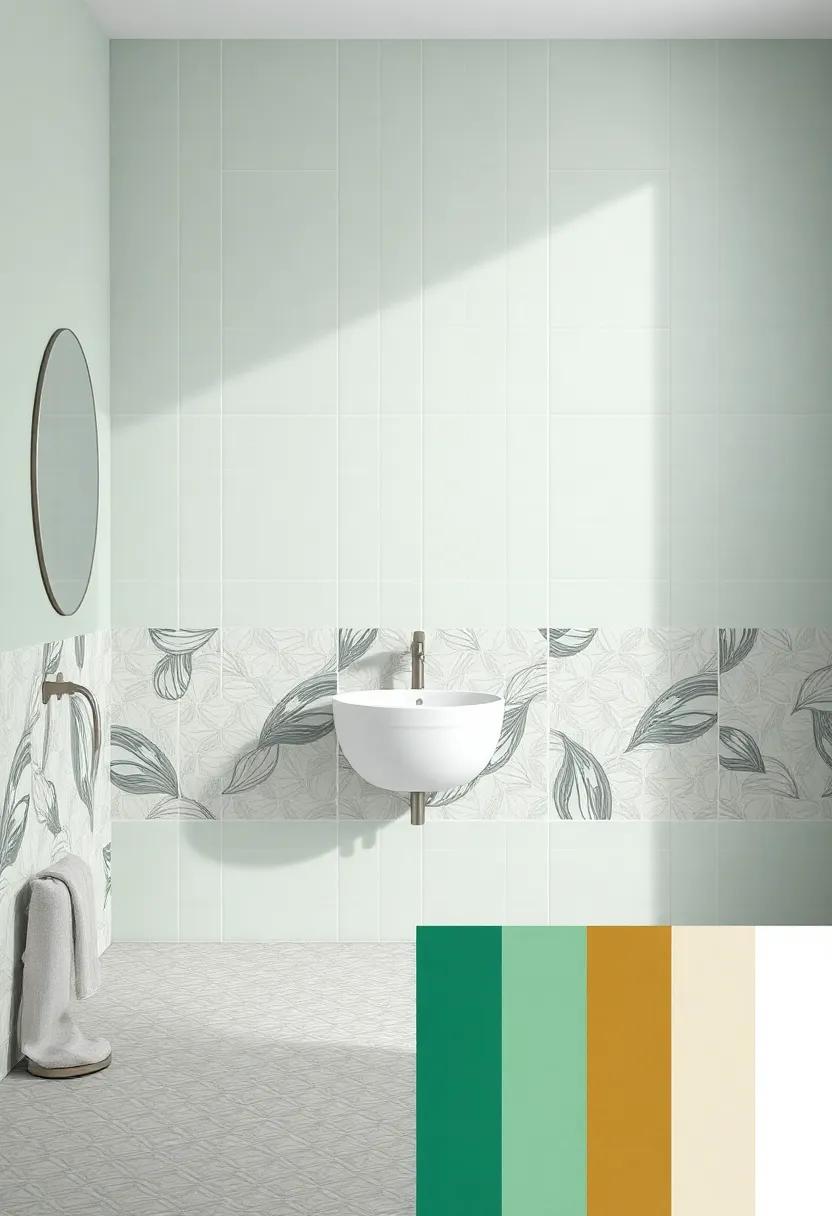
When it comes to selecting colors for your bathroom, nothing resonates quite like the hues found in nature. Drawing inspiration from organic elements can help craft a space that feels tranquil and refreshing. Think of the soft greens of a moss-covered stone, the gentle blues of a clear sky, or the warm browns of rich earth.These shades not only complement patterned tiles but also bring a sense of groundedness to the area. consider pairing sage green with intricate, floral tiles for a refreshing yet elegant vibe, or opt for a soft sky blue that invites calmness, ideally suited for white or light-patterned designs.
Here are a few color ideas inspired by the great outdoors that can enhance your bathroom:
- Ocean Teal: this serene shade mirrors the tranquility of ocean waves, ideal for a coastal theme.
- Sandstone Beige: A fantastic neutral choice that adds warmth and pairs beautifully with earthy tile patterns.
- Lavender Bloom: Inspired by lavender fields, this gentle hue offers a soft contrast to vibrant tiles.
- Forest Green: Evoking the depth of lush forests, it brings a cozy, earthy touch that can balance busy patterns effortlessly.
Vintage Vibes: Pairing Retro Colors with Classic Tile Patterns
Infusing a bathroom with vintage vibes can create an inviting and nostalgic atmosphere, especially when combining retro colors with classic tile patterns. Consider using soft pastel hues such as mint green, pale pink, and baby blue for the walls, which harmoniously complement patterned tiles like subway tile, herringbone, or hexagons. This fusion brings a timeless elegance to space,allowing the stunning tile designs to shine while maintaining a cohesive aesthetic throughout the room. Bold accent colors like mustard yellow or burnt orange can be introduced through accessories or features, enhancing the retro feel without overwhelming the visual appeal.
When selecting colors,it’s essential to consider the undertones of your tiles to ensure a seamless match. Focus on pairing colors that can evoke warmth and nostalgia, allowing textures and patterns to tell a story. Here are some complementary colors to consider:
- Soft Lavender – Pairs beautifully with white or gray patterned tiles.
- dusty Rose - Complements classic black and white tiles with a vintage flair.
- Sky Blue – Works well with intricate mosaic tiles, adding a fresh touch.
- Yolk Yellow – Brings energy and joy alongside customary checked patterns.
| Tile Pattern | Ideal Wall color |
|---|---|
| Subway Tiles | Soft Mint Green |
| Herringbone | Pale Pink |
| Hexagon | Light Peach |
| Mosaic | powder Blue |
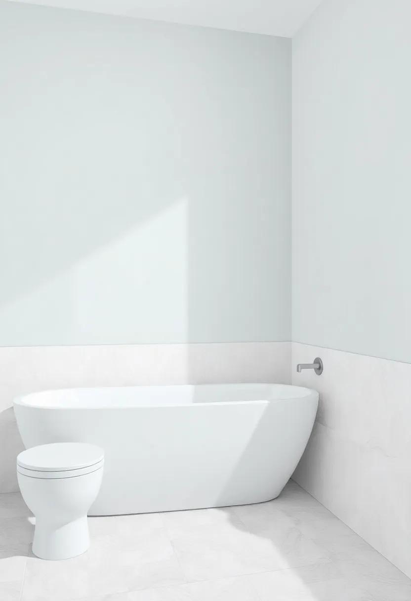
Modern Minimalism: Sleek Shades for a Contemporary Bathroom Makeover
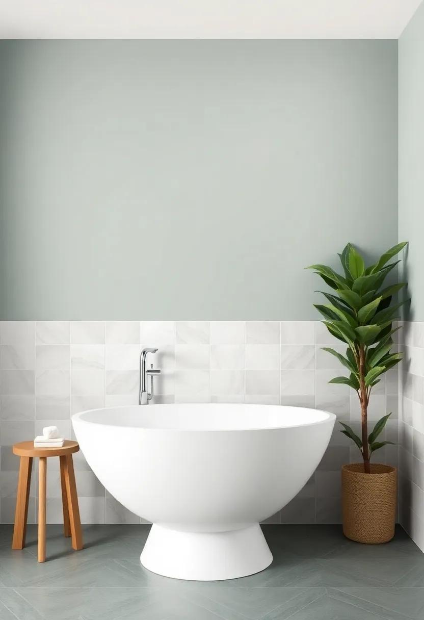
To embrace the essence of modern minimalism in your bathroom, consider incorporating sleek shades that effortlessly enhance the overall aesthetic without overwhelming the space. Choose soft neutrals such as pale greys, whites, or even muted beiges that act as a calming backdrop for your patterned tiles. These shades not only create a tranquil environment but also provide a seamless transition between the walls and any striking tile designs you might have. Combine these subtle hues with matte accessories like matte black faucets or brushed nickel fixtures, which harmonize wonderfully with the minimalist vibe while adding a touch of sophistication.
Another engaging approach is to experiment with monochromatic tones,where the wall color is a few shades darker or lighter than your tiles. This technique beautifully emphasizes the texture and patterns of the tiles, creating a cohesive look that draws the eye without distraction. Consider using a mix of soft pastels or deep saturated colors that complement the colors in your tiles, resulting in a chic yet understated atmosphere. Below is a simple comparison of colors that work harmoniously with popular tile patterns:
| Tile Pattern | Recommended Wall Color |
|---|---|
| Geometric | Soft Grey |
| Floral | Dusty Rose |
| Chevron | Warm Cream |
| Mosaic | Slate blue |
Eclectic Mixing: Combining Various Colors for a Unique Bathroom Experience
Embracing an eclectic color scheme can elevate your bathroom from mundane to extraordinary. Start by selecting a base color that resonates with the existing tiles, then introduce contrasting hues to create a dynamic visual appeal. Consider a palette that includes vibrant shades like coral or teal paired with muted tones, such as soft greys or off-white. The key is to strike a harmonious balance between playful and tranquil, ensuring that each color complements rather than clashes.Think about incorporating bold accents through wall art, accessories, or even a painted feature wall to unify the look while allowing your personality to shine through.
When it comes to mixing colors, remember that texture and finish matter just as much as the hues themselves. Glossy finishes can reflect light beautifully, enhancing your color choices, while matte surfaces provide an elegant contrast. As you explore options, consider these color pairings that work exceptionally well in whimsical bathroom settings:
| Color Pairing | Effect |
|---|---|
| Cerulean Blue & Mustard Yellow | Creates a sunny and uplifting atmosphere. |
| Soft Lavender & Cream | Conveys a calming, spa-like environment. |
| Coral & seafoam Green | Adds a playful seaside vibe. |
| Charcoal Grey & Peach | Brings a modern twist with a touch of warmth. |
By thoughtfully combining these unexpected colors and finishes, you can craft a bathroom that not only stands out aesthetically but also serves as a reflection of your distinctive style.Take your time to experiment with different combinations, and don’t be afraid to express your creativity—after all, this isn’t just a bathroom; it’s your personal retreat!
Understated Elegance: Whisper-Soft Colors for a Serene Escape
Embracing a palette of whisper-soft colors can transform your bathroom into a peaceful sanctuary,enhancing the tranquil vibe created by patterned tiles. Shades like powder blue, mint green, and pale lavender evoke a sense of calm, effortlessly harmonizing with intricate designs. These gentle hues serve as the perfect backdrop, allowing the tiles to shine while contributing to a cohesive aesthetic that promotes relaxation. The subtlety in these colors not only softens the boldness of patterns but also makes the space feel larger and more inviting.
When selecting your wall colors, consider the following pairings to elevate your bathroom experience:
- Pale Coral with navy tiles for a refreshing contrast
- Soft Sage against geometric gray tiles for a modern twist
- Delicate Cream paired with earthy-toned terracotta for timeless elegance
incorporating these shades not only emphasizes cleanliness and serenity but also provides an opportunity for creative expression through the layering of textures and accessories. When done right, the combination of soft wall colors and patterned tiles transcends traditional design, creating a serene escape that invites you to unwind.
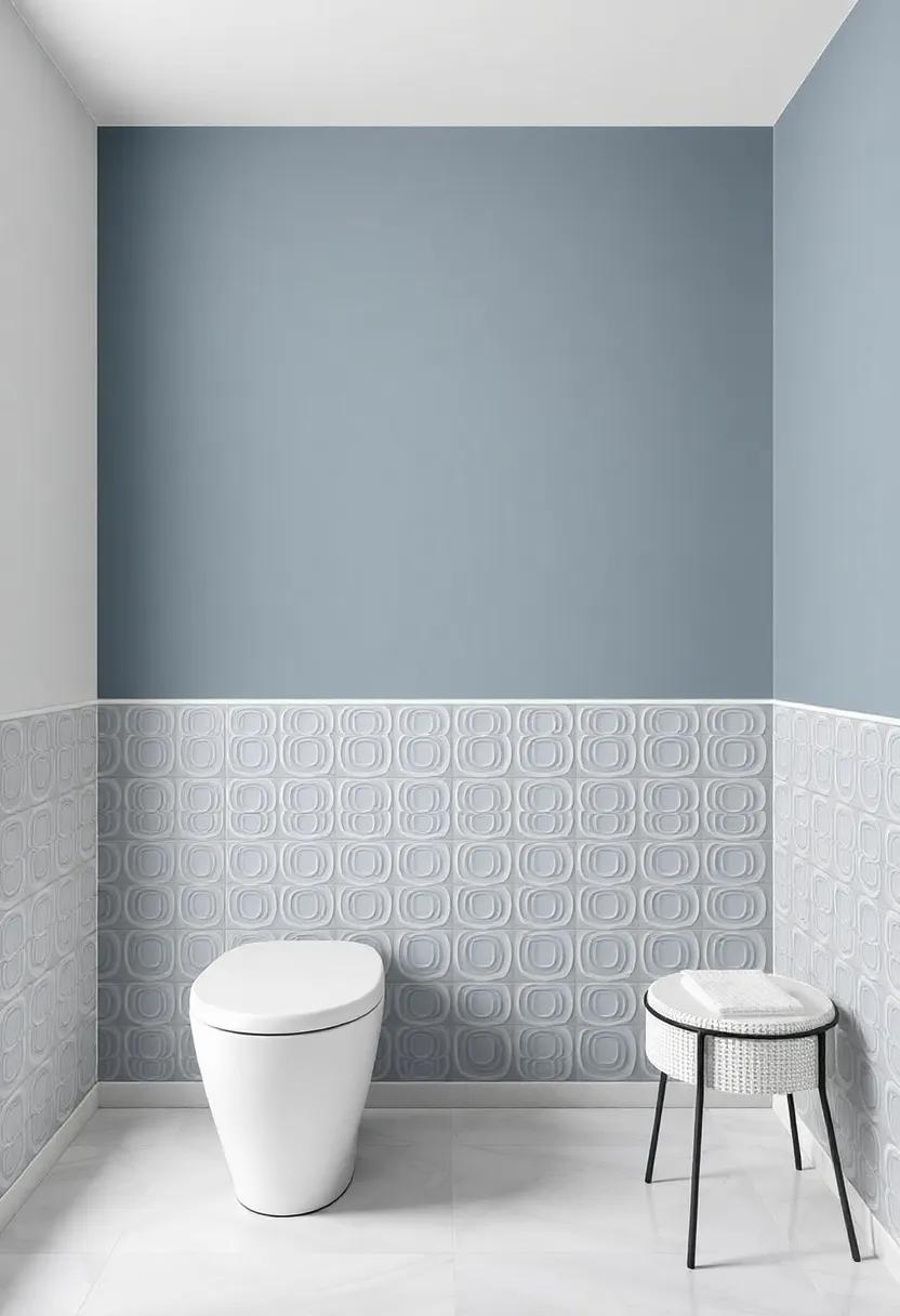
Coastal Inspirations: Bright Blues and Soft Grays to Evoke the Sea
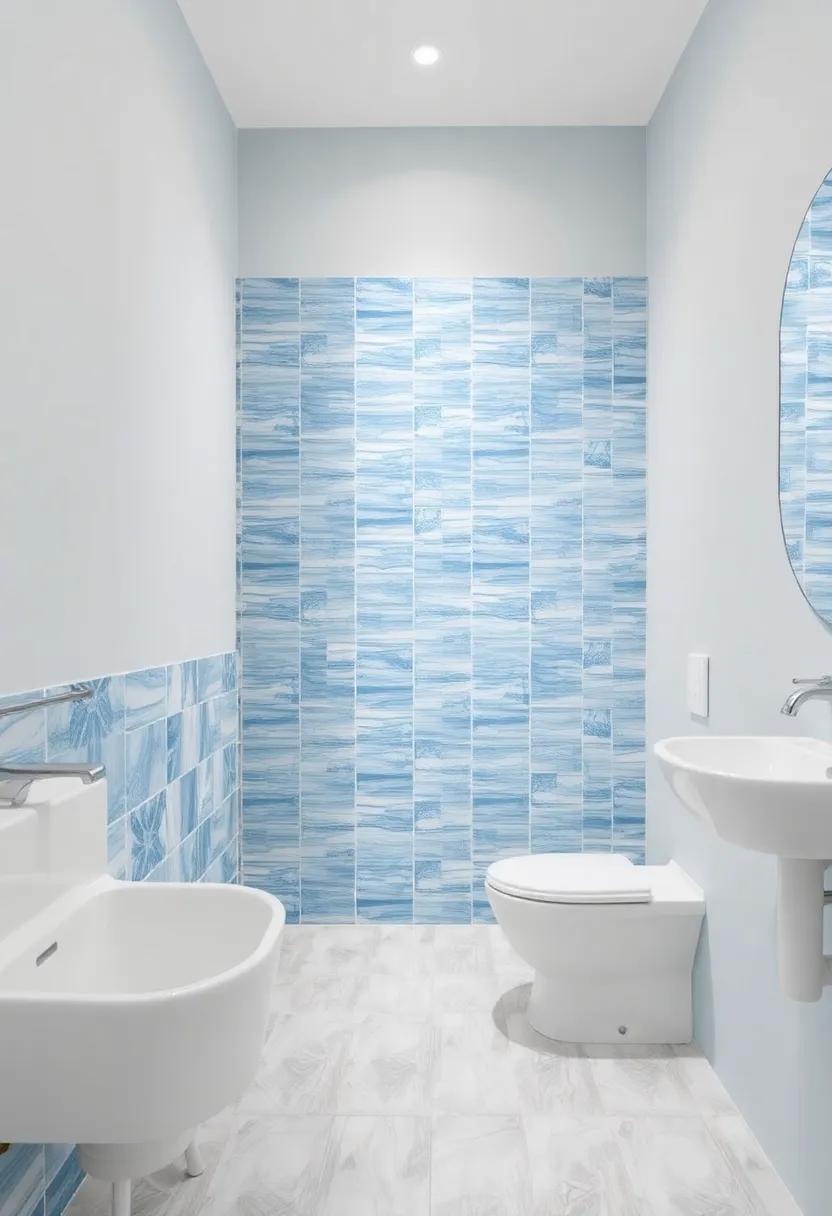
Transport your senses to the seashore by infusing your bathroom with a palette that mirrors the serene beauty of coastal landscapes. Shades of bright blue can evoke the refreshing essence of ocean waves, while soft gray can serve as a nod to sandy beaches. Together, these colors bring a harmonious balance, creating a tranquil atmosphere perfect for unwinding after a long day. Consider painting your walls in a soothing pale blue, which can enhance the light in the space, or opt for a deeper navy to create a striking contrast against patterned tiles, making them the focal point of your design.
Incorporating these hues can also be achieved through various accents, such as towels, bath mats, and decorative elements. Here are some suggestions to enhance your coastal theme:
- Accent Decor: Choose sea-inspired decorations like shells, coral, and nautical prints to complement your wall colors.
- Smart Lighting: Use warm white or soft blue LED lights to create a welcoming glow that reflects the serenity of the sea.
- Textured Fabrics: Layer different textures in soft grays and blues, such as woven baskets or cotton throw blankets, to add depth and warmth.
Warm Welcomes: Inviting Colors That Make Your Bathroom Feel Cozy
When it comes to selecting colors that create a warm and inviting atmosphere in your bathroom, consider hues that evoke a sense of tranquility and comfort. Soft earth tones like muted greens or warm terracotta can blend beautifully with patterned tiles, enhancing their appeal without overshadowing them. You might also explore delicate pastels, such as gentle pinks or light yellows, which can reflect light and add a cozy glow to the space. These colors not only harmonize with bold surfaces but also stimulate a sense of relaxation, making your bathroom a delightful retreat.
To further enhance the warm feel, explore accent colors that enrich the main palette. Some suggestions include:
- Rich creams to soften sharp lines
- Warm grays to provide contemporary elegance
- Muted blues to create a serene vibe
Utilizing a matte finish can also add depth and warmth that glossier paints may lack. Experiment with these combinations to find a scheme that not only complements your patterned tiles but also transforms the overall ambiance into a snug sanctuary.
Artful Layers: The Beauty of Combining two Complementary Color Schemes
Embracing the interplay between two complementary color schemes can breathe extraordinary life into your bathroom, especially when paired with patterned tiles.Imagine the elegance of a soft, muted wall color juxtaposed against the vibrancy of intricate tile designs. This approach not only enhances the visual interest of the space but also creates a harmonious balance that draws the eye naturally. A pale sage green wall can beautifully complement bright, multicolored tiles, making the bathroom feel both fresh and serene. Alternatively, consider a warm dusty rose; its subtle hue can soften the boldness of geometric tiles while adding a touch of sophistication.
When selecting your color schemes, focus on pairing shades that elicit a pleasing contrast yet share a common undertone.Here are some popular combinations to consider:
- Cool Blues and Sandy Neutrals – For a coastal vibe.
- Charcoal Grays and Soft Golds – Infusing elegance and warmth.
- Lavender and Mint Green – For a refreshing, pastel palette.
- Rich navy and Creamy Whites – Timeless and classic.
This thoughtful layering of colors not only enhances aesthetics but creates an inviting atmosphere that can elevate your daily routine.The right color combinations make your bathroom a sanctuary,highlighting your unique style while ensuring that your patterned tiles remain the star of the show.
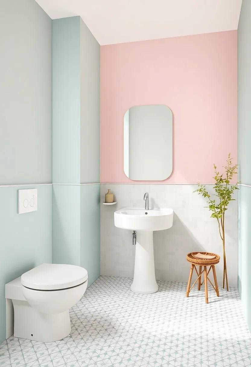
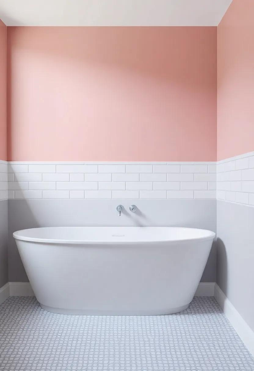
Crisp Whites and Pastels: A Bright Balance for Busy Tile Designs
When it comes to enhancing the aesthetic appeal of busy tile designs,the first rule is to maintain harmonious balance. crisp whites and soft pastels emerge as ideal companions, providing a refreshing contrast that softens the visual clutter.White walls can create an illusion of space, allowing intricate tiles to take center stage while giving the room an airy and open feel.Meanwhile, pastel shades like mint green, lavender, and powder blue imbue the setting with warmth and tranquility, seamlessly complementing the vibrant patterns without competing for attention.
Consider pairing patterned tiles with walls in light, neutral tones to enhance the overall ambiance. Popular pastel options can include:
- Soft Peach – A gentle touch, perfect for a cozy feel.
- Sky Blue – Invokes a sense of calm reminiscent of an open sky.
- Light Lilac - Adds a hint of playfulness without overwhelming the senses.
This strategic choice allows the personality of the tiling to shine through while maintaining an uncluttered look. A well-chosen pastel shade can create a sophisticated yet relaxed environment, where every element of design harmonizes beautifully.
the conclusion
As you embark on your journey to transform your bathroom into a harmonious sanctuary, remember that the walls are your canvas and the tiles are your art. The right color can elevate the aesthetic of your patterned tiles, creating a cohesive and inviting atmosphere. Whether you choose a serene pastel, a bold statement hue, or a soft neutral, let your personality shine through in every brushstroke. With the ideas we’ve explored,you have the tools to bring your vision to life,turning an ordinary bathroom into a uniquely styled retreat. Embrace the transformation, and revel in the beauty that a thoughtfully chosen color palette can bring to your space. Happy decorating!
As an Amazon Associate I earn from qualifying purchases.